In recent years, smart marketing technologies have come onto the scene, and sharp marketers have been leading the way in using them. Landing pages are a great example. Many businesses use them now, and marketers continue to find ways to improve their effectiveness. New solutions focused on navigation, page load times, titles, mobile-friendly designs, content types, and more have been created, and just recently, video has joined the mix.
Eye View Digital estimates that adding video to your landing page puts you in a position to experience an 86% increase in your conversion rate.
Whenever possible, make an effort to first develop a great landing page and then create an incredible marketing video to be part of it. Note that these two aspects go hand in hand.
In the rest of the article, I’ll be sharing detailed tips and techniques that will teach you how to combine landing pages and video in a way that will lead to growth in your conversion rates and sales.
Landing Page Design
What distinguishes a landing page with text and images from one that includes videos is that the latter follows specific guidelines. Factors like page load time are much more important for a video landing page, and naturally, such a page will need more resources because of the videos.
In designing a video landing page, there will be choices to make. One of the most prominent is deciding how you are going to host your video. You’ll have two options: either opt for video player plugins or select a video host such as YouTube. Note that each option has its unique advantages and disadvantages
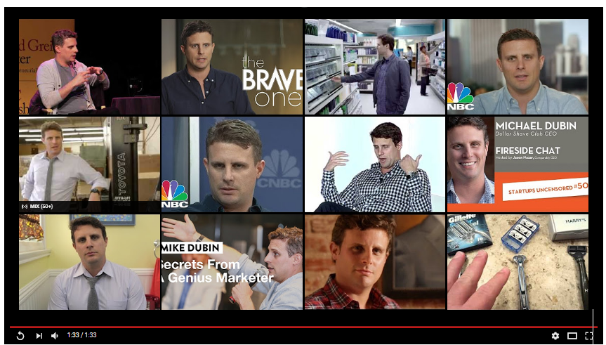
For example, embedded YouTube Videos more often bring up a list of related videos when a video comes to a close, as can be seen in the image below, and this has the potential to drive away traffic from your page. It could even be worse when the suggested videos are from your competitors.
Nevertheless, some businesses prefer to utilize both for different reasons.
Another aspect to consider is having the proper balance between the white space and the content on your page. The purpose of this would be to help focus the attention of your audience on the relevant aspects included on your landing page such as the headline, lead capture form, customer testimonials, call-to-action buttons, video and so on.
It’s also recommended that you place testimonials by industry leaders or influential personalities to address certain potential objections, along with contact details plus a logo to vouch for the business’s credibility.
Don’t forget that social share buttons on a video landing page will make it easy for your prospects or customers to share your content on social networks if they feel compelled to.
On the question of how long or short a video landing page should be, there’s no straight answer, but this guide by HubSpot helps to put things into perspective.
Video Calls-To-Action
Digital marketing basically entails two things. Getting as much traffic as you can to your page and then turning this traffic (prospects) into paying customers. The last part is a responsibility that rests with the video’s call-to-action on your landing page.
To optimize it, there are a few of things you will have to take into consideration.
Color – Different colors are known to leave different impressions and meanings. It’s your duty as the marketer to test them to see which one works well with your video CTA. Ensure that the color stands out not just for your audience but from the rest of the page to draw attention to the CTA.
Location – This will require tests as well. Placing your CTA above the fold, below it, or anywhere else usually attracts different conversion rates. Find which place works best for your business through A/B testing.
Design – Two common forms that video CTAs take are text and image. Coming up with a creative combination of both may boost conversion rates.
Button copy – “Order Now”, “Buy Now”, and “Click here” are all examples of common button copy you will see around. What’s unfortunate about them is that they are so generic and rarely leave a reasonable impact on the conversion rate.
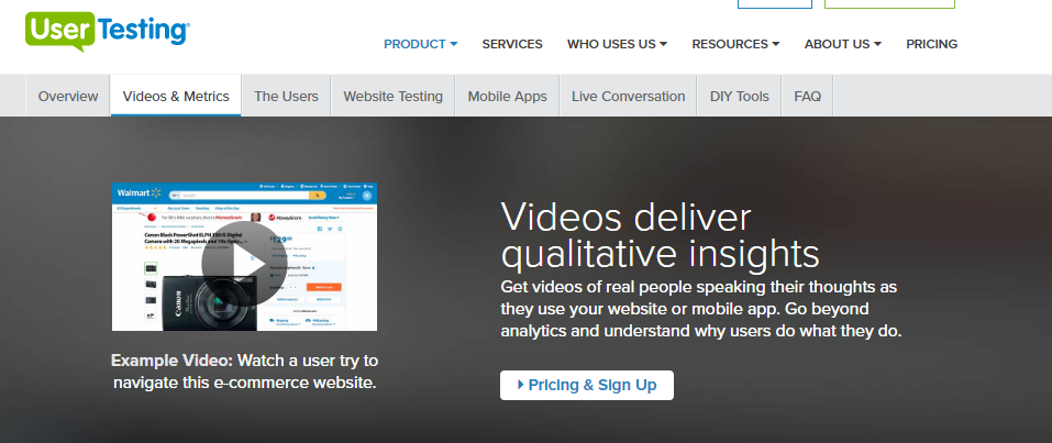
It would be best, therefore, to try different text but one that is related to your product, such as ‘Claim Your Free Trial”, “Let’s Start A New Project Together”, or a more detailed and compelling CTA as this from User Testing:
Remember, creativity matters and so make an effort to go beyond the standard video CTA. Above all else, test your experiments until you find what works best for you.
Autoplay vs Press Play
Each of these options has circumstances under which they work best. Understanding them is key, and so, to begin with, know what’s leading your prospects to your video landing page. If it’s a video thumbnail with a play button or some heads up that reads “Visit our page to see our video,” autoplay always works best.
But if your visitors arrive at the landing page and a video starts to play right away without warning, they are likely to be annoyed (Warrior Forum) and some will probably leave the page immediately – especially if the content of your video is of a sensitive nature.
Interestingly, platforms such as Facebook and Instagram recently embraced autoplay on their feeds. As much as this attracted mixed reactions, there’s a sizeable section of people who admitted to actually liking it.
Nevertheless, if you decide to have the video autoplay without warning on your landing page, compare the conversion rate to the press-play situation and let the results guide you on what option to take. Remember to make the player controls such as pause, stop, and volume up/down visible and clear.
Speaking of press play, a Vidyard report reveals that the option was found to work better in blog posts, training modules, web pages, social media, and company intranets. And from the consumer’s perspective, as seen in Warrior Forum, many actually prefer when there’s a play button on a landing page.
All the same, as a marketer, your goal should be to ensure that whoever arrives at your landing page gets to watch your video. How you do it doesn’t matter, whether it’s autoplay or press play. Just find what works for you.
Video Positioning And Sizing
Even though there’s a lot of debate about it, the space above the fold of a landing page has more often proved itself to be the sweet spot because it gets the most attention. And going by this information, this is where the most engaging video content you have should be fixed.
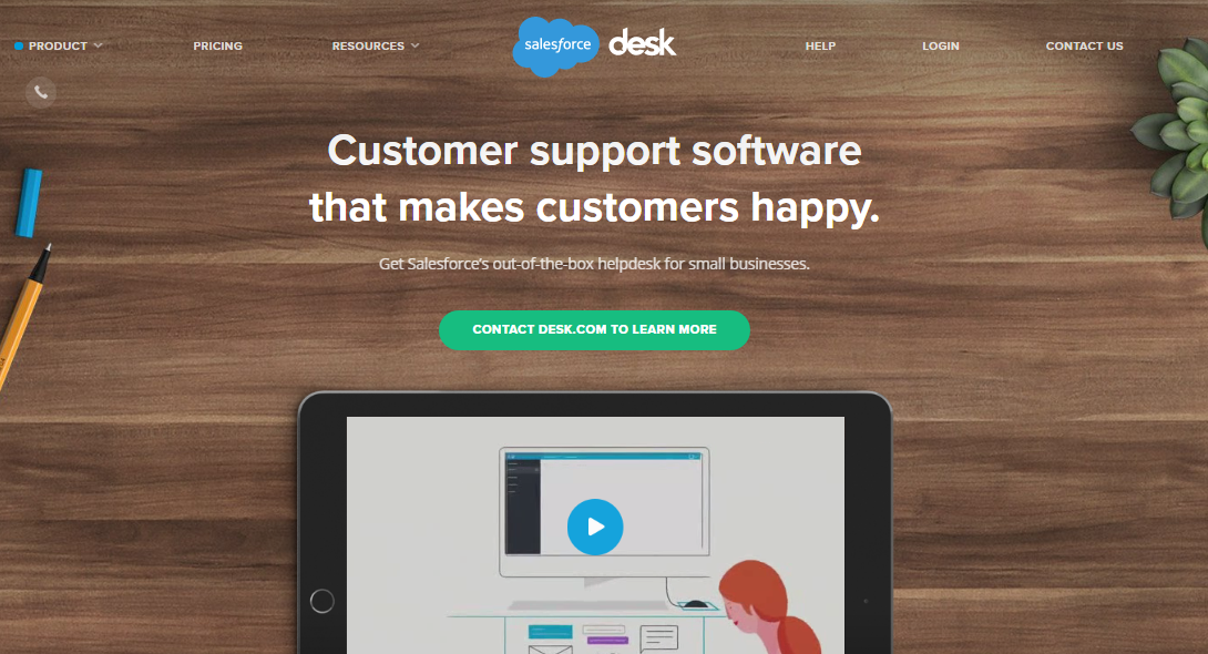
What that means is that your landing page video should be placed at the center and to the front of the page where there will be no barriers to those who are ready to press play and watch the video as clearly shown in this desk.com landing page.
However, if you would love your prospects to scroll further down, make sure you are offering them something that will compel them to want to go below the fold.
Understandably, when it comes to size, it matters a lot to have the video on your landing page stand out, but that doesn’t imply that it should take up the majority of the space and overshadow everything else on the page.
Instead, give it a moderate size (for a higher play rate, Wistia research recommends 401 pixels x 600 pixels). At the same time, remove unnecessary headers, sidebars, or any other details that can clutter the space and draw focus away from the video.
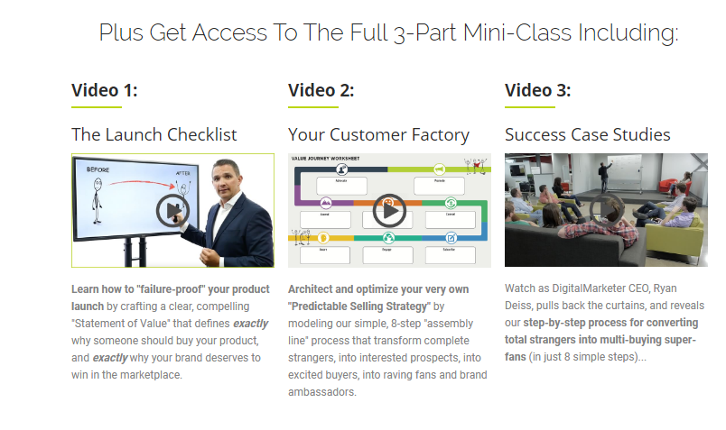
Apart from your main video, you can also add additional related videos that serve to reinforce the message in your main video and a perfect example of this can be viewed on this Launch Grid’s landing page.
Use Custom Video Thumbnails
What immediately comes to mind when you mention video thumbnail is a static image extracted from a video complete with a play button. Well, the majority you will see actually appear that way, but is that all a video thumbnail should be? Certainly not.
You have to remember that, to increase the chances of prospects watching your video, the thumbnail has to be tempting enough for the person to click on; it should be an opportunity the person should not afford to pass up.
Your video landing page will certainly have its special design, but if you let the player pull the thumbnail from the video there’s no guarantee that the thumbnail will stand out or blend in well with a page.
A custom video thumbnail is like a movie poster. It holds enough power to attract clicks plus engage your prospects and convert them into customers. That’s why you need a custom-made thumbnail complete with graphics, titles, and other details that will evoke tons of clicks. Using contrasting colors on your text and graphics is one way to capture the attention of the prospective viewer.
Humans or human faces are also an aspect you will want to consider as we are psychologically drawn to stare at other humans or their faces with the intention of gathering more information.
Over 33 million people have viewed this Squatty Potty toilet stool video and its success can partly be attributed to its funny video thumbnail, reinforced by the presence of a human with an expressive face, a unicorn, and its poop among other things.
Stay away from adding too much text or text that is small and selecting images that are either relevant or misleading. Such practices will affect the conversion rate negatively.
Video Quality And Length
If a person only views a part of the video on the landing page and then stops before reaching the call-to-action because the video is boring, less engaging, of poor quality, or for any other reasons, this would mean that the video actually achieved nothing.
Well, there’s no doubt that the majority of the visitors coming to your landing page are after quick answers and if you are clear and brief about it, you stand a higher chance of converting them into your customers.
Research by Wistia, a top video marketing platform, reveals that the engagement level is higher for shorter videos than longer videos. The completion rate for a 1-2 minute video is better than that of a video that is 10-20 minutes long.
But there are exceptions to this. Engaged online video viewers devote more than 7 minutes a day to videos and some can spend up to one hour on videos in a week alone. But note that to win over such viewers, your content has to be incredibly engaging. Video personalization is among the few recent trends and practices you should consider when it comes to raising the engagement levels on your video.
Admittedly, there are situations where you may have too much content that requires a lengthy video, say an intense tutorial. One way to go about such content is to come up with a series of short videos for the same or if you decide to serve all of it, keep it 6 or 12 minutes long as they are both sweet spots. (Wistia)
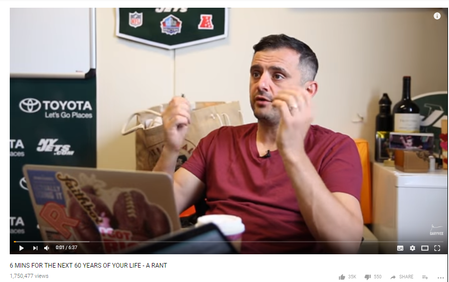
Gary Vee’s tutorials are a good example. His content is engaging and even when he does 6-minute videos, as can be seen below, he still gets millions of people to watch his content.
Lastly, invest time in learning about the best practices involved in the production of a marketing video because video quality plays part in influencing the conversion rate.
Craft Different Videos For Different Audiences
Before you execute this kind of campaign, you have to note that each video is supposed to be placed on a separate landing page, complete with all the details that seek to address the needs of that particular audience.
Segmenting your target audience is a key part of digital marketing, especially if you are targeting customers at different stages of the buying cycle or from different demographics.
Certain videos will resonate more with a specific audience. For example, if you are targeting a younger audience, you can decide to use an animated video. At the same time, there will be those videos that include the company founder or CEO speaking and this will resonate more with a certain audience.
What’s special about this is that if you tailor your video content to a specific audience, you will eventually be directly addressing their needs, desires, questions, and other concerns, which will increase the potential of converting them into customers.
Another aspect that is closely connected to having more landing pages is that they open up more conversion opportunities and bring in considerable SEO benefits. Considering that the majority of your landing pages will be indexed in search, you stand a chance of getting more traffic that will be going straight to your different landing pages.
And since you have more than one landing page, you will be getting tons of visitors, which translates to increased conversion opportunities and improved ranking on SERPs.
Lastly
To sum up, one thing is clear. It’s upon every savvy marketer out there to know and understand the fundamentals of designing a proper landing page and creating a quality landing page video. Put simply, a video landing page should be well designed, clean, uncluttered, and free of distraction, and on the other hand, the video itself should be well positioned and of proper quality, size, and length.
If you need support or have anything else to share or questions to ask, I would be glad to hear from you in the comments below.
