Let’s admit it!
Product Video is the Master Key to eCommerce conversions.
Meaning, you cannot, and should not, take product videos with a grain of salt. This, also means, product images and product videos need to co-exist like never before. And, there are no two ways about it, unless, of course, you are creating videos for personal viewing and not for customer consumption.
Here’s the problem:
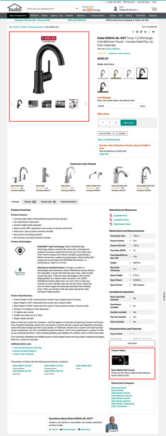
Nearly 35% of the eCommerce sites have dumped videos in some obscure corner of their product pages. Even when they may have marshaled significant resources and money to get a proper video made. Needless to say, customers of these sites may not take the trouble to scroll down to the place to where these product videos are placed.
E.g. Build.com customers have to scroll down a lot before they can find the product page videos.
Such product videos, rest assured, will never catch the attention of a single customer. So, in a way, these sites are actually defeating the purpose of creating a video, which is to grab more and more customer attention.
If you are still not convinced about the importance of product videos, the stats shared below are sure to persuade you to take some proactive measures to get your videos right on your product pages:
- ECommerce product pages with video convert 80% better than those without
- 74% of the users watching an explainer video would end up buying the product
- 60% of the consumers prefer watching a product video over reading a description
This post will focus on the placement aspect of your product videos as well as other vital elements to accelerate your eCommerce conversion rates.
#1. Not Placing Product Videos right next to the Image Gallery
For all the stats and facts that emphasize the significance of product videos, we need to clear the first hurdle: getting your customers to view your videos. You may have moved heaven and earth to get your videos right; however, it makes little difference if your customers are not viewing it.
The point is, placement of videos plays a crucial role in their discoverability. Ideally, your product videos should be placed right next to the image gallery or mixed up with other images within your image gallery. If not, the user will face a hard time locating your video.
Users, if anything, expect images, 360-degree views, and videos to be placed together because videos complement your product images. So, no matter what, make sure your videos are set right beside or are mixed up with the main product images on the Product Page.
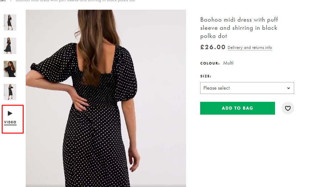
ASOS site gets it right with its product page videos.
Further, before thinking about the placement of your product videos, get your act right in terms of image galleries.
Simply put, your image galleries should be right at the top of the product page. Why? It’s because users inevitably view the image gallery when they land on the product page. And when you add videos to the image gallery, it would automatically increase their discoverability.
Furthermore, you need to add all your product videos in the image gallery and not just one or two.
It’s also important to note that you are free to repeat your videos elsewhere as well on your product pages and not just in the image gallery. In fact, you could think of embedding it in the content section all through the product page. If launching product page videos are not part of your wheelhouse, seek the help of top video production companies to launch polished, purposeful, fool-proof videos.
#2. Not Overlaying Video Thumbnails with ‘Play’ icon
Once you have mixed up videos with standard image gallery thumbnails, the next step should be to overlay it with a “play” icon.
Users can easily make out a video from the image thumbnails if the videos have the ‘play’ icon displayed on them. So, it doesn’t matter whether you place them next to the image gallery thumbnails or make them a part of the image gallery thumbnails. According to Baymard Research, even still frames from videos overlaid with a ‘play’ icon works well with the user.
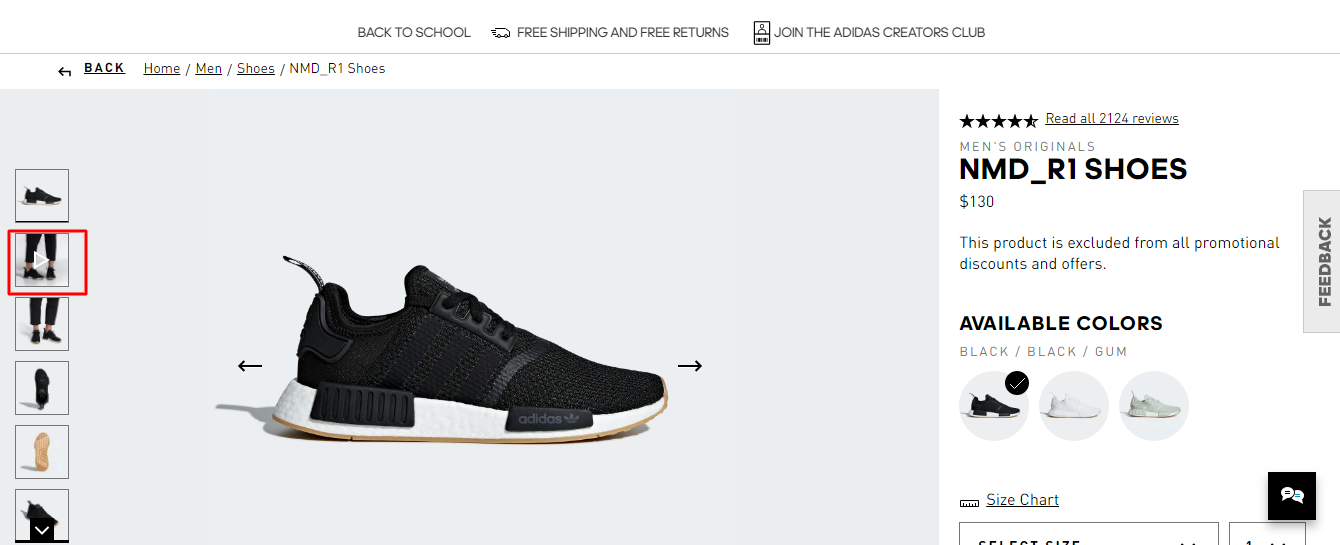
Adidas has positioned a product video right next to its first image. Though the video is mixed with other image gallery thumbnails, it stands out because of the “play” icon overlaid on the video thumbnail.
What’s more, avoid using tabs to separate the video thumbnails from image thumbnails in the image gallery. Why? Because it has been observed that tabs cause severe discoverability tissues.
#3. Not Focusing on the Product, but on the Plot
If you are planning to create a product video storyline on the lines of a Hollywood movie storyline, be rest assured, it would be a total disaster.
Film production and product videos are like chalk and cheese. For films having a compelling plot is a prerequisite, which is not the case with product videos. The product video should singularly focus on the product and its benefits. We don’t need an Aladdin with a magical genie giving shape to your product. Make it plain and simple, but powerful. Focus on the problems and how your product has been specially designed to address the issue. Make it straightforward — no beating around the bush.
Believe it or not, there’s a magic way to get more views for your product videos. One, place them right up front alongside images. Two, get the message right; no BS, no fluff.


