Staring at the tiny LCD progress bar of the vending machine in a lobby, I realize nothing pisses us off more than indefinite waiting times. Especially people waiting for their coffee, their cheap flight comparisons, or their computer to finish doing whatever it’s doing.
Since the creation of software, there has always been loading times. An early example comes from Bob Stahl’s way-ahead-of-its time article in February 1986’s Computerworld.
Stahl remarks that in 1986, plenty of commercial products used progress bars and recounts an earlier situation where a similar effect accidentally provided great UX:
“We once delivered a pre-production version of a system to a customer for testing. For debugging purposes, every 10th record during a long write to disk was also written to the screen. We explained to the customer that the display only served debugging purposes and would not appear in the production.
The customer’s reaction surprised us. He liked seeing all those records scrolling up the screen. His reaction was, “Hey, look at all the work it’s doing!””
After reading a piece on Facebook’s staged loading times, I realize loading times and progress bars go far beyond an accurate visualization of completion, and go deep into our psychology, starting with the first major commercial OS — Windows.
“Even if you can’t give an accurate estimation, stick a progress bar on it” — Windows
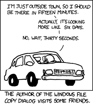
Like so many things, there’s no better way to explain this phenomenon than with an XKCD comic:
This is a common observation, but I wonder whether the writer knew that inaccurate loading estimates are by design?
Here’s a quote from Windows’ design guidelines:
“Use determinate progress bars for operations that require a bounded amount of time, even if that amount of time cannot be accurately predicted. Indeterminate progress bars show that progress is being made, but provide no other information. Don’t choose an indeterminate progress bar based only on the possible lack of accuracy alone.”
I remember experiencing this first-hand, many Saturdays of my youth. I’d happily return home from town with a copy of Age of Empires or Warcraft, and pop it into the disk drive of my machine running Windows 98. Often, the install would be stuck at 30% for an hour before rushing up to 95% and sitting there for what felt like forever.
The installation process followed Windows’ advice perfectly: It had no idea as to the transfer rate from CD to HDD. It didn’t even know the size of the files it was transferring. All it knew was it that it had transferring 300 out of 1000 files, so that must mean 30%.
These 300 files could be tiny textures and sound snippets that took less than a minute to transfer. The remaining 700 could each be ten times bigger than the whole block so far. The bursts of progress and long lulls made me extremely anxious that the game I’ve been excited for all week might seize up on me and give me some shocking, irrevocable error. It all comes down to the Windows motto: When in doubt, stick a randomly incrementing progress bar on the thing to shut ‘em up.
Joking and childhood frustrations aside, inaccurate progress bars are hardly a cardinal sin. It’s true that percentage-based progress bars improved Microsoft’s UX, because my god are the indeterminate ones frustrating…
In his 1985 paper The Importance of Percent-Done Progress Indicators for Computer-Human Interfaces, Brad A. Myers talks about progress bars — along with some quaint examples like a thermometer-style bar — as a way to reduce user anxiety.
“Even with supposedly interactive computer systems that may have “easy-to-use” interfaces with menus, icons or whatever, the user will still be faced with periods when the computer has not finished processing a request. […] If there is an indication of progress, however, or if the user knows a priori how long the task will take, then the time can be used in some productive manner. This lowering of the users’ anxiety is an important benefit of progress indicators.”
So, it makes sense that Windows opted for a percent-done bar even if the percent done is pretty much a lie. It’s in the best interest of the user.
The beneficial illusion of slow loading: “We thought long and hard about your request”
Computers can process huge datasets in milliseconds, but users can find that difficult to believe, especially under certain circumstances.
With software becoming more and more human, we expect it to stop and think before it gives us an accurate answer. We’re used to meaningful thought — or even older software — taking its time to process requests so when an action happens too quickly, users can end up feeling like the computer has overlooked something.
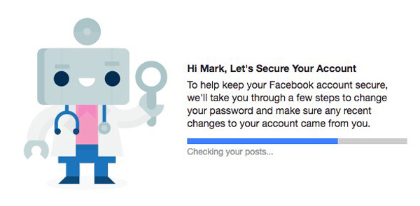
I found a recent example of this in a Fast Company piece on Facebook’s security checkup. The check appears to take many times longer than it actually does, because Facebook users would obviously not want their account security to be taken lightly, and having some dialog box rapidly flashing up “DONE!” feels a bit like taking it lightly.
So, instead, Facebook’s UX team designed a box where the progress indicators have about as much truth as the loading screen of The Sims:
Yes, Facebook is checking your posts about as much as Sims is disguising outdoor stereos.
We want a computer to put time and perceived effort into sensitive topics like security, but possibly the most sensitive topic of all is money.
Ever noticed how sites like Last Minute take time to crunch the numbers when they’re calculating the best deals for you? Regardless of the amount of queries and filters the site really has to process can’t possibly be so vast it takes longer than Google does to load results from every indexed website in the world. The point is that it gives you the illusion that it was trying really hard to save you money.
It all comes down to trust. I remember seeing a scene in Gilmore Girls where a disgruntled customer calls to check for vacant rooms and is upset when the receptionist tells them ‘no’ instantly without giving them the illusion that they’ve checked.
Funnily enough, even though we understand that computers and humans work differently, sometimes we want them to appear that they work the same way.
The illusion of speed
There are situations when waiting brings us no reassurance or psychological benefits, like when we just want to get to our damn data and don’t care about whether we trust that app’s ability to search or process thoroughly.
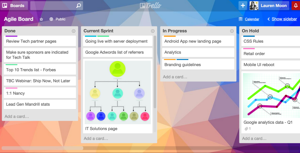
A great example — both because it’s well documented and executed — is Trello, who create exceptional user experiences.
In 2014, a developer at Trello’s creators, Fog Creek Software, dedicated an entire week to reducing the loading time of a Trello board. Starting at a lumbering 8 seconds, he tried to cut it down by at least 1 second every day.
He made slow progress at first; reducing CSS and making small aesthetic tweaks. Four days into the experiment, he made a breakthrough.
By loading elements in layers, starting with the top layer first, it gave the illusion of fast loading. In one day, he’d cut the loading time down by 5 seconds.
For all intents and purposes, the board does load, but the content in the cards is loaded later on demand. Instead of forcing the browser to load the entire board and all of its information at once, he implemented something called progressive rendering.
When you move a card in Trello, it’s designed to show you that the card has been moved instantly, but the request is still processing in the background. It only fails in cases of bad connectivity or some other rare case, so it’s safe to show users that illusion 99.9% of the time.
If you go to a Trello board and open a card, you’ll notice that it loads in chunks. The frame, then the images and comments. By loading the most vital information first, it gives users the illusion of a snappy loading time, even when what’s happening is that you’re seeing a half-loaded screen.
95% Complete
In writing this piece, I’ve realized there’s a lot more to loading time and progress bars than meets the eye. Progress bars were first conceived of in pre-production software, where activity would be printed to the console so the developers could see the last operation before the software crashed. Consumers didn’t need to see this, and there wasn’t much emphasis on UX back then, so it was removed before it shipped.
As it turns out, no one likes being kept in the dark, the computer silently doing inscrutable binary stuff while you worry that it’s crashed. In Myers’ first progress bar experiment, it showed that 86% of people preferred progress bars.
I guess that applies to fake ones, too.


