A few weeks ago, I gave a speaker training with the suggestive title “Death by PowerPoint”. Some of you may know the famous Dilbert comic with the same title that was published more than 20 years ago (please follow this link if you want to see it, as I don’t want to infringe copyright.) And, although my presentation’s headline sounded like a quip, it was also reporting on a dead serious incident. Pun intended.
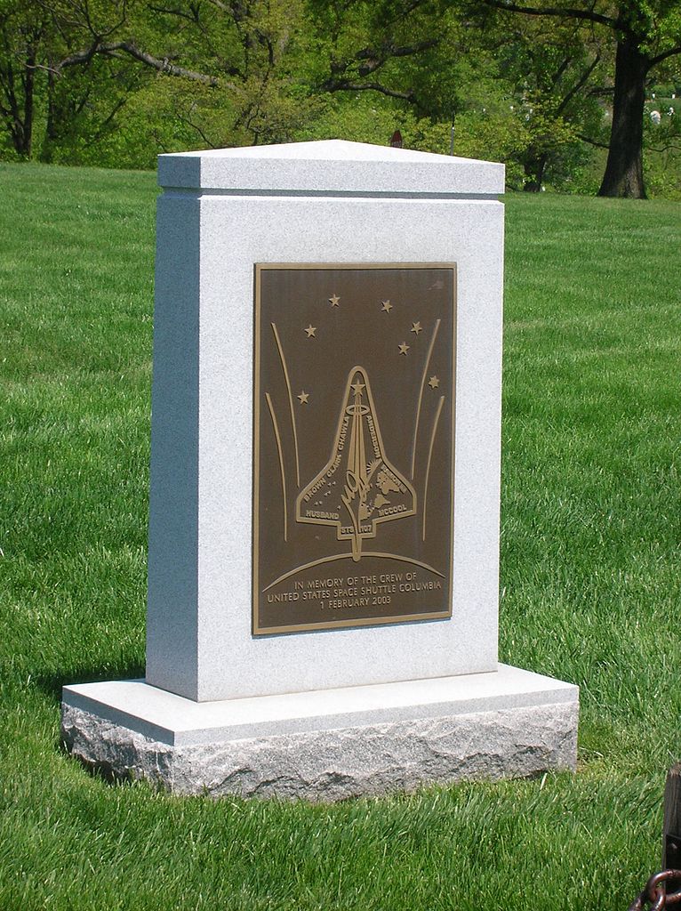
On February 1, 2003, the space shuttle Columbia exploded when re-entering the Earth’s atmosphere during its descent from space. All seven astronauts aboard were killed. The accident was caused by a large piece of foam that broke away from the shuttle’s external tank and punched a hole in the spacecraft’s wing. After the event, Space Shuttle flight operations were suspended for more than two years.
Photo: Space shuttle Columbia memorial in Arlington National Cemetery by Alexmar983 (CC BY-SA 3.0)
A tragic (and less known) detail is that this disaster most probably could have been prevented if some Boeing engineers had created better PowerPoint slides for NASA. In their report, the Columbia Accident Investigation Board (CAIB) wrote:
“The Board views the endemic use of PowerPoint briefing slides instead of technical papers as an illustration of the problematic methods of technical communication at NASA.”
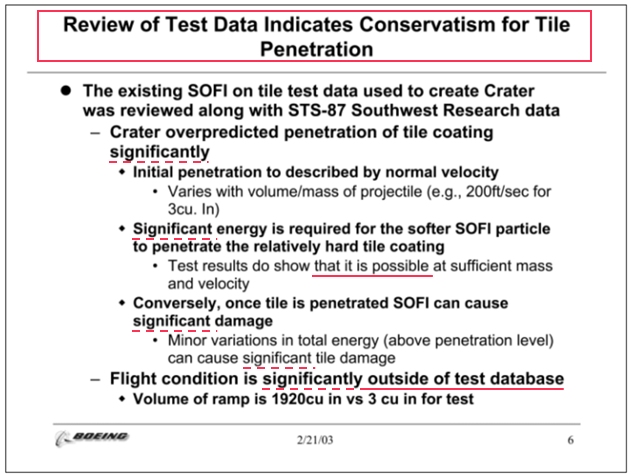
Here’s a slide that was identified as particularly problematic (markups in red are mine):
Well, the least one could say that this is an overloaded, unstructured and inefficient visual with major design and content flaws:
- The most important issue certainly lies with the title of the slide. It (kind of) conveys a positive result of the tests and doesn’t give a warning about the fact that some of the measurement data were not relevant at all. The title of a –extremely wordy– slide that is centered in a large font on top of the page is assumed to summarize the key message.
- Only the last bullet at the bottom of the page (assuming that everybody reads a slide to the bottom) tells that the actual flight conditions were significantly outside of the test database: the debris that hit the spaceship were 640 times larger than the data used for the test model.
- Other messages communicated on this slide were also vague or ambiguous. How would a manager interpret something being “possible” at “sufficient” mass and velocity without a reference to the real probability or the critical mass?
- Also, the word “significant(ly)”, that appears five times on this page, can be loosely interpreted and it’s never combined with a qualifying term like “statistically” –which could have alerted the audience.
- Other important warnings appear to be hidden deep in the bullets list (some even at the third level), which –in combination with too many words to digest– could be overlooked by the reader (note that this slide was presented to a live audience, but also distributed as an email attachment to people who would get their information only from what’s written on the page).
Hence, the CAIB concluded:
“As information gets passed up an organization hierarchy, from people who do analysis to mid-level managers to high-level leadership, key explanations and supporting information is filtered out.
In this context, it is easy to understand how a senior manager might read this PowerPoint slide and not realize that it addresses a life-threatening situation.”
The engineers felt they had communicated the potential risks but didn’t succeed. NASA managers listened to the engineers and read their PowerPoint but didn’t understand…
In an article about bulleted lists in my look’n’feel matter series, I wrote that bullets can make your sheets dull, boring and ineffective. As your brain interprets every letter as a picture, wordy lists literally choke it. As a consequence, people tend to forget what you have spelled out. And in another post on this page, I pleaded for slide titles with long and descriptive assertions that orient the audience to the upcoming content, while giving them a clear takeaway message.
QED. Lamentably for the Columbia crew and their families.

