Companies use a wide range of vital analytical tools to ensure they are making the smartest business decisions, and a Pareto analysis is one of the most important. Using this technique effectively can identify weak areas in your operations, generate more profits, and increase productivity.
At Business2Community, we want to provide you with all of the vital resources you need to succeed and grow your business. In this detailed guide, we will walk you through everything you need to know about the Pareto Principle and how it can transform your business model to make it more profitable.
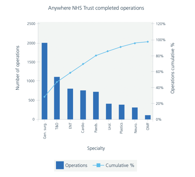
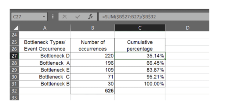
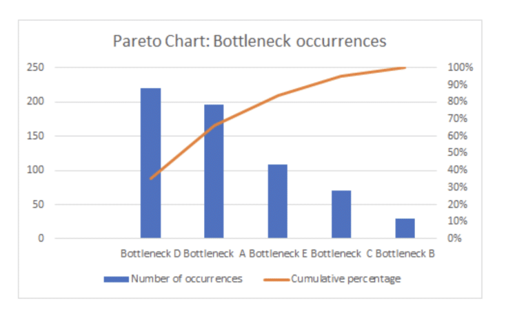
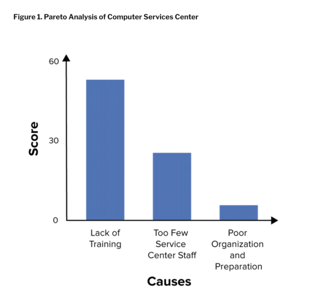
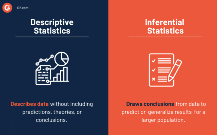
A Pareto analysis is a simple decision-making technique that plots the relative importance of different factors in descending order in a bar chart. The Pareto Principle states that 80% of outcomes come from 20% of efforts/causes – and this method is used to identify that 20%. Italian economist Vilfredo Pareto first developed the Pareto Principle between the late 19th century to the early 20th century. He noticed that 80% of the land in Italy was owned by 20% of the population, giving birth to the 80/20 rule. The Pareto Principle built the foundation for welfare economics, allowing policymakers to narrow down the root causes of certain effects. Nowadays, the Pareto analysis is a popular qualitative data analytical tool in the business sector. As a project manager or business owner, you may rely on this decision-making tool to focus efforts on profit-generating elements. The results of a Pareto analysis could look something like this: On a Pareto chart, the relative frequency of each cause to the outcome is shown in descending order, showing both the individual importance as well as the cumulative total of all causes. For example, in this Pareto diagram created by the National Health Service UK, the number of completed operations is shown in decreasing order by surgical type. When you cut off the cumulative percentage at 80%, you will find the most important causes to be general surgeries, trauma and orthopedic surgeries, ENT surgeries, and cardiac surgeries. These surgeries are the 20% of surgeries that contribute to 80% of total surgeries completed during the observed period. Pareto charts penetrate every sector and are widely used for decision-making, quality control, and customer surveys. it conducts an effect analysis to inform analysts about the main areas for quality improvement. By learning about the contribution of each factor to the outcome, policymakers and businesspeople can curate more favorable proposals with higher customer satisfaction rates, resolve operational issues, and identify the negative impact of certain changes. Whether you’re a business owner looking to investigate possible causes for the recent drop in sales or an employee trying to understand certain phenomena in the company, a Pareto chart can help put things into perspective. Now we’ve covered the basics of the Pareto analysis, let’s take a look at the elements in a Pareto graph and how you can create one. A Pareto diagram assumes all data points recorded are available for you to access. It is based on facts observed and does not make assumptions about reality. To do a Pareto line graph, you first need to gather information on the elements you are targeting. Here are the elements you need to decide: For example, you’re a project manager at a marketing firm and you want to understand the problems related to a recent poorly-performed campaign. Your scope of the study is this particular campaign and the study period is one month. You can distribute a survey to relevant stakeholders such as your target audience and the marketing team members to collect data. Your survey reveals the top problems to be outdated web designs, slow internet speed, lack of training for marketers, and lack of communication between team members and senior managers. Based on your preferences/needs, you can group these elements into technology issues (web designs + internet speed) and internal management issues (lack of training + poor communication) or keep them separated. Once you have all the elements you need, you can start plotting the data points into a Pareto graph. To create a Pareto chart, these are the key steps: To make things simpler, here is a graphical illustration created by the management software platform Tallyfy. The example demonstrates the study of bottleneck occurrences. You would record the number of occurrences of each bottleneck and plot the data points into the chart you’re creating. If you put all the causes (bottlenecks A – E) into a scoring system according to their weight, bottleneck D gets the top score, followed by bottleneck A, while bottleneck B will get the lowest score. A scoring system helps you rank each problem based on its magnitude of positive/negative impact. Plotting a line at 80%, the graph shows that bottleneck D, bottleneck A, and bottleneck E contribute to 80% of the total occurrences. A Pareto analysis allows you to prioritize factors with the maximum value as they bring the most impact to the outcomes. In the example above, focusing your efforts on bottlenecks D and A should lead to a significant improvement in the occurrences. On the other hand, Bottleneck B holds very little value and is unlikely to bring much benefit even if you work on this factor. Not all causes weigh the same in business operations. Identifying major causes will not only save resources and budget but also increase efficiency and determine a profitable business flow for you. There is extensive use of the Pareto principle in the real business world. To give you an idea of how this method can aid your decision-making processes, here are a few examples. Let’s use an illustration created by the management platform Mind Tools to see how a Pareto chart can assist in quality control. In this example, we want to find out the culprits for poor customer service and how to improve the performance. You find three total causes, with a lack of training scoring the highest, followed by not having enough staff and poor management. Based on the Pareto Principle, the company can centralize resources on the top 20% of causes of the problem to refine the customer service experience. According to the analysis, instead of investing in hiring new service staff, providing adequate training to existing staff is much more likely to improve the service quality and save costs. As a business owner, identifying money-making products with a Pareto analysis is probably the most common reason for using it. When you plot data into a Pareto chart and put the revenue on the left side of the y-axis and products on the x-axis, you can easily find the Pareto optimal point that highlights 20% of your top-performing products. The first bar on the right is the best-selling product. To utilize resources, you can follow the scoring method and focus production efforts on product lines that generate the most revenue. Let’s assume you run a marketing agency and want to renovate the office space to improve the satisfaction rates for customers as well as your employees. A survey is a great tool for data collection to create a Pareto diagram. With the 80/20 rule, you can distill down major things customers and employees look for to refine the user experience. In an ever-changing business environment, updating your Pareto analysis often is necessary. Luckily, since this data analysis method is fairly straightforward, adjusting the numbers does not require a great deal of effort. First, decide whether you need to collect completely fresh data sets like conducting new surveys or reading new reports. Then, update the chart with the new data points and rearrange the order if necessary. Updating the Pareto analysis is simple as long as you pay attention to the changes and correct the numbers so the bar chart is always in descending order. Although a Pareto analysis is useful in summarizing past data to locate high-performing elements, there are a few main limitations to this technique that will require you to combine this method with other analytical tools for the best results. It is vital to know what is going wrong, but, it is equally important to know how to fix the problem. Unfortunately, a Pareto analysis does not take you much further than presenting the issues. It does not offer you actionable solutions. Once you’ve pinned down factors to work on, you will have to conduct other analyses to figure out how to take proper action. The 80/20 rule is a convenient rule of thumb that doesn’t take into consideration relationships among causes. For example, your analysis may tell you that updating your equipment is a significant factor to focus on while training team members is not as important. However, in reality, your staff may be providing sub-standard services because of the outdated technologies and the lack of training on them. Buying new equipment alone won’t solve the issues if your team doesn’t know how to handle them. There is no way to point out the relations between causes with the Pareto rule so you have to take extra measures to connect the dots. A Pareto analysis is based on past data. While it picks out key points in an area of interest, it doesn’t make business forecasts, which are essential for the operation. It is a qualitative analytic tool rather than a quantitative one. To compensate for this, you can incorporate this method with quantitative research tools like descriptive statistics and inferential statistics. Conducting a Pareto analysis is the first step to dissecting your business components and highlighting the main areas to work on and improve. As an entrepreneur, you’ll find this method handy and practical in developing your next business model.Pareto Analysis – Key Takeaways
What Is a Pareto Analysis?
Why is it Called Pareto Analysis?

What Does a Pareto Analysis Look Like?
Who Needs to do a Pareto Analysis?
How to Perform and Interpret a Pareto Analysis
Elements in a Pareto Chart
Step-by-Step Guide to Creating and Understanding a Pareto Diagram
Examples of Pareto Analysis
Example 1: Locate the Root Cause for Major Problems
Example 2: Identify Money-Making Products
Example 3: Deliver a Better User Experience

How to Adjust Your Pareto Analysis
Limitations of Pareto Analysis
It Does Not Offer Actionable Solutions

It Does Not Consider the Relationships Between Causes
It Does Not Provide Crucial Business Projections
The Value of Pareto Analysis
FAQs
What is a Pareto analysis used for?
What is the Pareto 80/20 rule?
How is Pareto calculated?

