3 Types of CTA Formats to Maximize Conversion Opportunities On Your Website
If you have any experience in the world of online marketing, you’ve likely heard of calls-to-action, or CTAs, those attractive images or blocks of text that grab your viewers’ attention and, well, call them into action.
CTAs can be embedded in a blog post, an email, on your website, in an eBook, or any number of other places where your online viewers are likely to be visiting.
Your calls-to-action can encourage your viewers to do a variety of things: download an eBook, acquire a coupon for a discount or a special offer, subscribe to your blog, sign up for a webinar, or submit their information for your email list. It’s an easy, cost-effective way to get your viewers’ attention and encourage them to interact with your brand in a variety of ways.
Unfortunately, like all things in the world of marketing, not all CTAs are created equal. There is a wide variety of styles and iterations of this important marketing element, and it’s important to know the differences and the right time to use each one.
Here is a showcase of three different styles of CTAs, and how you can ensure that they are effective for your brand.
Text-Only CTAs
A simple, text-only CTA can be highly effective when placed strategically, whether it’s in the middle or at the bottom of a blog, within the body of a great email or on the home page of your website.
An effective text-only CTA will be a natural extension of the content and images around it.
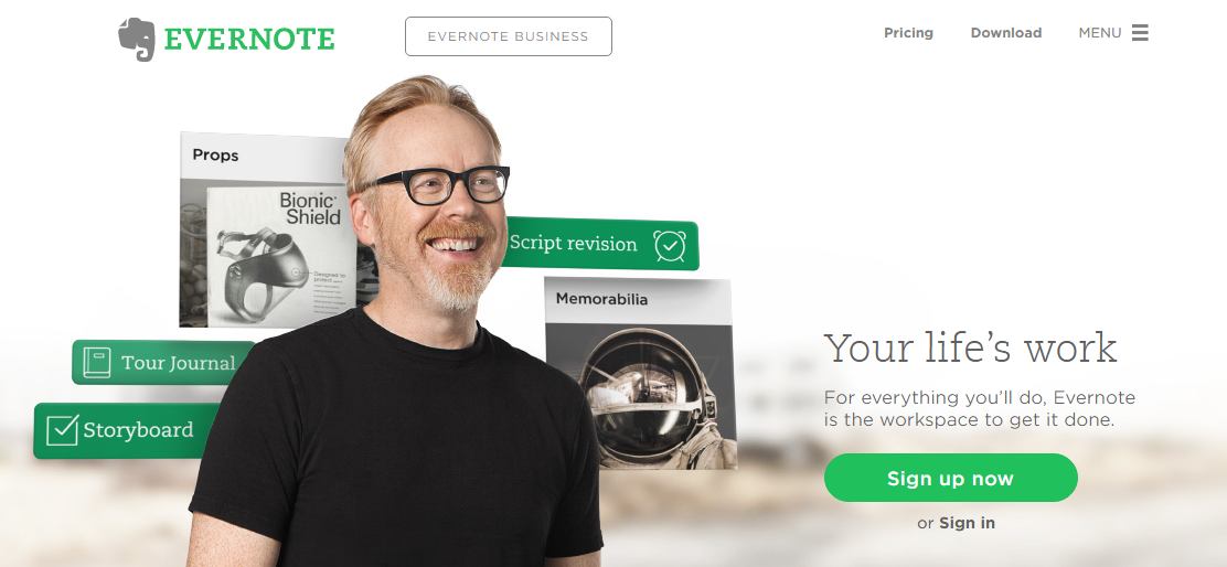
Evernote, for example, utilizes an efficient CTA on their website’s home page. They draw their website visitors in with the phrase “Your Life’s Work” and hold their attention with a succinct summation of what their product offers: “For everything you’ll do, Evernote is the workspace to get it done.” The CTA that follows is text-only and simple in design, but is a natural and attractive extension of the information viewers have just absorbed. It also incorporates a complementary color scheme and easy-to-read font to create maximum attraction for viewers.
There are multiple other kinds of text-only CTAs that can inspire your viewers to engage with your brand.
A text-only CTA that includes too much information and overwhelms your viewers isn’t likely to be successful. This CTA from Macy’s, advertising an upcoming sale, is chock-full of text, offers, codes, categories and graphics. So much content can discombobulate the viewer and send them for the “exit” button—that is, if they can find it.
Text-With-Graphics CTAs
Creating an attractive call-to-action that combines both text and graphics can be tricky; you want the course of action to be clear for your viewers, yet you need the graphics to be attractive enough to draw them in.
These types of CTAs are great for emails, where you have a limited amount of space to draw a viewer in and convince them to engage with your brand.
They also work well at the bottom of blogs as a natural extension of the content your viewer has just read.
A CTA that has poor graphics, an incoherent or unattractive design or too much text can overwhelm a viewer and will do little to inspire them to engage with your brand.
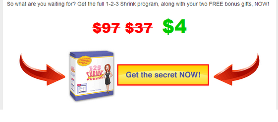
The CTA below features text that is nearly too small for the viewer to read, an overload of white space, and a general incoherence of design. Notice how the graphics are nearly indiscernible as they disappear against the white backdrop; similarly, the embossing on the arrows looks outdated.
These CTAs, on the other hand, combine a commanding use of clear, easy-to-read text and graphics that are natural and complementary.
Pop-Up CTAs
Pop-Up Calls-to-Action can walk a fine line between seeming immediately overwhelming or flustering your viewers or providing them with a quick route to content they are interested in.
The majority of internet users say pop-ups annoy them, especially when they don’t offer a quick route of exit if the viewer isn’t interested. When you interrupt your website visitors’ experiences with pop-ups that are poorly designed, contain an overload of text or don’t offer a clear trajectory towards action, you’re simply detracting from their website experience.
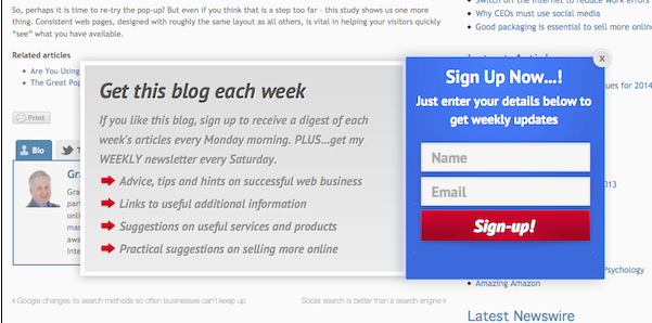
This pop-up CTA, for example, is loaded with text, so that the viewer has to spend a sizable amount of time reading before they even know what the call-to-action is for.
Now take a look at a pop-up CTA that offers a cleaner, more direct message; it’s succinct, offers clear buttons representing distinct actions, and gives viewers an easy method of exit if they aren’t interested.
Calls-to-action are an important part of getting your online audience to act; great design, a clear value proposition and intuitive placement are just a few of the elements that will help ensure that your CTA is successful in driving conversions for your brand.
Read more:
