Know Your Customer – and Precisely What You Want Them To Do
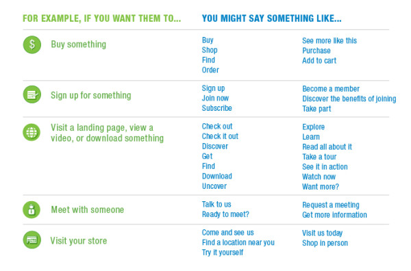
In order to create the perfect call to action, you need to know exactly what it is you want your audience to do. A call to action is not an order or a request – it’s a suggestion. You need to understand what your customer wants, as well. Consider the CTA as a helpful guide – something that points the reader in the right direction so they can continue with their journey.
It doesn’t have to be a hard sell, like “buy now” or “add to cart before this deal explodes!” But it does have to clearly state exactly what your audience should do next
Remember, if you tell your potential customers to click on a link to visit a website, make sure the site is ready for them and that it contains all the information they’ll be looking for. Obstacles and annoyances at this stage are sure to make people to give up on you and look elsewhere. An effective landing page is a great way to help people find what you’ve promised them in your call-to-action. Every CTA exists in the context of a bigger picture.
Digital marketing strategist Rebecca Otis recently outlined the importance of context in a great blog post about content strategy. She pointed out that helping site visitors understand the Before, During, and After (BDA) process of a call to action is a key factor in building a better relationship with customers – and encouraging them to act. With a solid BDA process, you can become a better partner to customers and prospects because you reduce their doubt, set their expectations appropriately, guide them throughout the process, help them if something goes wrong, and reward them for their successes.
Call to Action Strategies That Get Results
So what does it take to create the right magic phrase that gets people to act? Here are seven tips that can help you create better, more effective CTAs.
1. Keep it straightforward: The best, most powerful calls to action are often simplest. Calls to action should be as short and easy to follow as possible. Complicated instructions may drive your potential customers away or frustrate them, and that’s bad for business as well as your brand image. Phone numbers should be easy to remember, clickable (especially for mobile), or tied to an image or statement that will boost recall. Web addresses should be short and clear.
2. Use action verbs: Verbs indicate action, and strong verbs make it clear what action should be taken. Your CTA should begin with an action verb that tells your potential customer what to do next. “Consider giving us a call” is weak. “Call now” is simple, direct, and to the point. Try to avoid any verbs (or verb forms) ending in “ing.”
3. Make your CTA stand out: The two most prominent elements of your advertisement or marketing message should be the headline and the call-to-action. Set off your CTA so that it can’t be mistaken for something else. Use larger fonts, appealing graphics, or some other way to draw attention to the CTA. And make sure it’s placed prominently; a call-to-action that’s buried below the fold isn’t going to get noticed. A sidebar or navigation bar can be a great place for your CTA.
4. Use the right tools – and the right incentive: Technologies such as QR codes can improve the response rates for your call-to-action – but only if they’re done right. E-Consultancy has some great examples of good, bad, and ugly QR codes. Using them on product packaging and in printed marketing messages makes it easier for readers to respond. But a QR code isn’t a call-to-action – it’s just a shortcut. Slapping it on a magazine ad doesn’t mean someone will scan it. You need to have a value attached to it, like “Scan to go behind the scenes” or “Get a special bonus just for readers of this magazine.” And remember to make sure the code links to a mobile-optimized landing page.
5. Connect with social media: Use Facebook, Twitter, LinkedIn, and other sites as destinations for your calls-to-action. Providing a direct link to your social media platform will give potential customers another way to engage with you. Don’t just ask someone to “like” you if you haven’t given them a reason. Provide value here as well, like “Share your favorite product on Facebook and get entered to win a $10 gift card.”
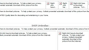
6. Don’t limit your CTA to an image: Have other (one or more) CTAs in the text. If an email or website doesn’t render images correctly, the primary message in your image CTA will be lost. And remember: many email programs (such as Outlook) disable images by default, so your text CTA must do the heavy lifting as well.
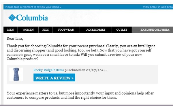
7. Don’t be afraid to repeat yourself: Use multiple CTAs at the top and bottom of the page and within the content itself. If you’re sending an email, make sure images, headlines, and products all link to relevant landing pages. Provide different value propositions for taking the same action. For example, in addition to a button that says “Download the guide” at the side of an email, in the copy, you could include a text link that says “get 7 winning CTA strategies for marketers.” By the same token, don’t be afraid to limit your message to a single action. The more decisions you force your audience to make, the more likely they are to decide against making any choice at all. Multiple, parallel offers and links can be confusing.
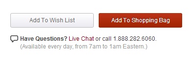
Bonus call to action tip:
To find a better call to action for your audience, test out multiple versions to find one that resonates. Test colors, fonts, button styles, wording, placement, and anything else you can change in your creative execution. Do limited-time offers really work with your customers? One size doesn’t always fit all. The best way to find out for sure is to test it. Consider testing different CTAs for different segments. Try out whether or not personalization works with your audience. Some people might respond well to seeing “Jane, buy a sleeping bag to go with your new tent!” Others might be turned off by it.
And once you’ve found a winner, don’t rest on your laurels. That shiny blue button that says “ORDER NOW!” might work today, but in a few weeks, the subtle green link that says “Get fresh deals for smart shoppers” might resonate better.
Continually test new strategies in order to optimize your results. It’s the best way to make sure your call-to-action drives the response you want – and the results your business needs.
