iOS 7 has been available for just over a week, and after some problems downloading it on the first day, we finally have it. We’ve given it a thorough test. There are features we really like and some we don’t, but overall, we’re pleased with the update and how it improves Apple devices. Check out the features we love and those we dislike below.
Pro – Accessibility is at your fingertips with the new Control Panel

One of the major updates in iOS 7 is the new Control Panel. Now, all the important features are in one spot and can be turned on or off with just a tap. Turning Wi-Fi on and off used to be a hassle that required going through the Settings menu. Accessing music, your alarm, Bluetooth, and calculator is much simpler now with the Control Panel. As soon as I downloaded iOS 7, I instantly removed my flashlight app. You can reach all the essentials by swiping up on your device.
Pro – Multitasking is much smoother
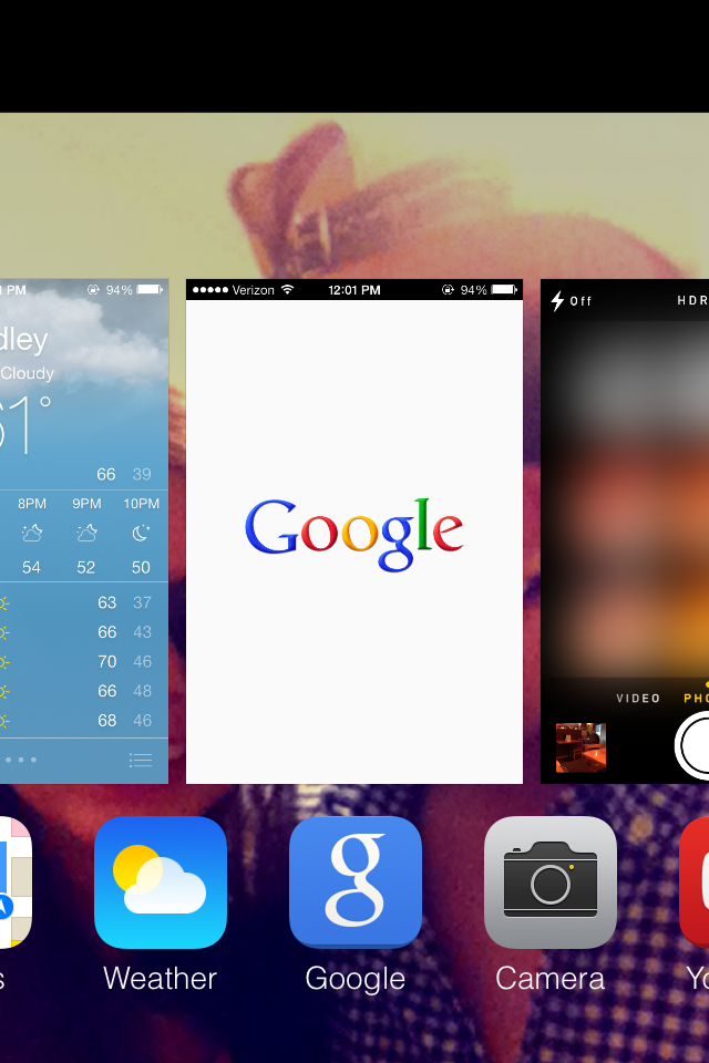
Multitasking is a feature that Apple has fallen behind in innovation. Previous versions of iOS featured a Fast App Switcher tray that was neither visually appealing nor easy to use. iOS7’s multitasking features a card-based interface that fits in beautifully with the new design. In addition to the great look, this feature learns your behavior. iOS 7 learns when you like to use your apps and can update your content before you launch them. So if you tend to check your favorite social app at 9:00 a.m. every day, your feed will be ready and waiting for you.
Pro – Overall design is a much needed upgrade
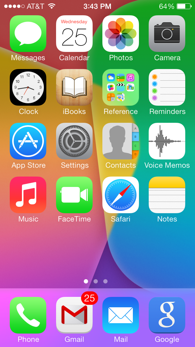
New icons, parallax design, new home screen are all contributors to the overall design of iOS 7 which is gorgeous. It might just be because we have been seeing the same design since 2007. The app icons have a new flat design. The color scheme adapts to the background on your lock and home screens seamlessly. For some this is the visual update that Apple lovers have been wanting for years.
Con – The bold new look is a turn-off for some
iOS7 has got an updated look after six years of the same design. The new look is indeed breath taking but it has been met with some criticism. The initial comments I have heard about the new operating system is that it is “too bright,” “very colorful” and “childish.” Now there are reports that people are getting motion sickeness from the new update. iOS7 has incorporated the ever popular flat design along with a new palette of bright pastel colors that complement both the lock and home screens. This is a complete contrast to previous iOS versions. Apps looked like buttons and the color scheme did not adapt to wallpaper.
Con – Not all apps being optimized iOS7 gives us an incomplete feel
The Beta version of the OS was made available by Apple in June after the WWDC Conference, yet most of the developers are not optimized their applications for the iOS7. Most of the apps except a few have not yet integrated the new look and features of the iOS7, not giving the users a complete feel of the new OS yet. We don’t see the new Key Pad being used frequently or the consistency of design applied. Only the core Apple apps and few popular apps like Facebook and Twitter have got the new look. I use Whatsapp frequently, and this app has not been optimized for the new OS. The app still has the same look and same key pad. I forget I have upgraded until I go back to home screen. Users will only get a feel after all of the apps they use frequently have optimized to iOS7.
Con – Lag when opening an app is an unnecessary feature
There is an exaggerated zoom effect when starting up an app on iOS7 from the home screen. You get the feeling like you are diving into an app which is exciting at first but gets old fast. A half second might not seem like much but when I am in hurry want to get the app opened quickly, this feature may seem overstated and unnecessary. Opening an app should be instant it does not need to be an extravagant event.
Read more:


