While leaping bravely from pipe to pipe, narrowly escaping death in the jaws of a man-eating plant, Mario fights tirelessly to save his princess. We are all too familiar with Mario’s personal life, but what about his work life?
We know Mario and Luigi are plumbers by day, residential contractors in the Flatbush community of Brooklyn, New York. They even have a great business slogan: “You clog ‘em, We clear ‘em!” But how would Mario and Luigi market their plumbing business in today’s residential contracting scene?
Like many small service businesses, Mario likely bought his domain www.mariobrothersplumbing.com and created a basic website in the early 2000s. But now, with most of his free time taken up by chasing Koopah and his crew, Mario would surely be connecting with his customers online to stay financially afloat. So how would Mario promote his plumbing business in 2013? He would focus on what he knows best: GAMES!
Make It Fun
Promoting your business online doesn’t have to feel like ‘all work.’ You’re on the internet, after all, one of the most enjoyable places around! A simple way to dive into content marketing and attract visitors to your website is by creating and sharing infographics.
Infographics have traditionally been crammed with data. Part of the appeal of an infographic is that a high amount of data can be presented graphically and aesthetically. But as hordes of infographics have been thrown at us through the years, we have become inundated with useless statistics and have become jaded to boring graphic content.
I will never read through an infographic that takes several minutes to complete. I rarely enjoy the feeling of laboring away at an endless math equation. So I can safely assume that the average web surfer who lacks my infographic fetish will have an even shorter attention span than my own.
If your graphic contains so much text that I can’t get through it in a minute, then I’m closing the page and moving on. If you want to present paragraphs of text with your graphics, write a blog with pictures. (Or better yet, create an e-book, Slideshare presentation, or other creative media). Graphics should be more graphic than text; it’s that simple.
To keep their website and blog content fun, FH Furr, a plumbing and HVAC business out of Washington D.C. created and shared this wacky infographic with their customers and fellow plumbers, keeping it fun for their audience:
Go with the flow
I once overheard a description from a colleague to his wife: “An infographic is a graphic that sort of tells a story with (its layout)”. If there is no flow to a web graphic, my eyes will not follow it. After learning to appreciate art and artists over the years, stumbling across a graphic with no flow just won’t grab my attention.
Even this minute, there are scores of unemployed or self-employed graphic artists in your town with talent oozing out of their ears. A perceptive managerial figure in a contracting business will be hiring those creatives who can tell a story with graphic layout, keep their work fun, and actually connect with customers.
Perhaps the greatest in the history of data visualization, Edward Tufte, shared some valuable suggestions:
“Clutter is a failure of design, not too much information.”
“If something is confusing, don’t blame the user; fix the design!”
“It’s better to have people study data than to dictate it to them! (The audience is like you; they don’t need to be told how to understand your stuff)”
Finally, about writing a summary, he says, “If your summary is tough to write, your content is weak”.
A visual recap of an Edward Tufte presentation, captured and illustrated by McGarrah Jessee’s Lauri Johnston can be found here:
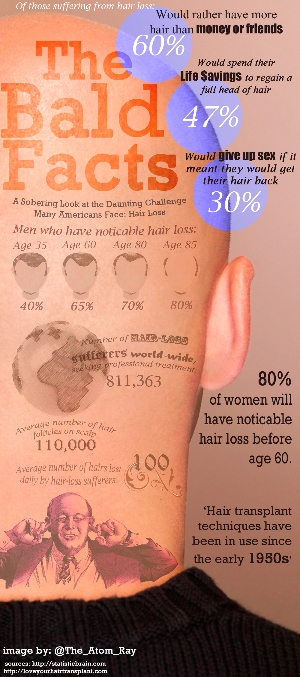
This infographic, published by Dr. Tim Love of Oklahoma City, utilizes a few simple stock photos and a handful of facts for a simple, quick read-through. You’ll notice that I’ve strayed from the complicated drawn-out infographics of the olden days.
Set the Data Aside
Web graphics do not need to be all infographics! Design a game with your graphic or tell an interesting story! Create hilarious graphic memes to be shared on social media. Graphic content marketing has become too single-minded and creative directors should be exploring the entire potential of graphic web content.
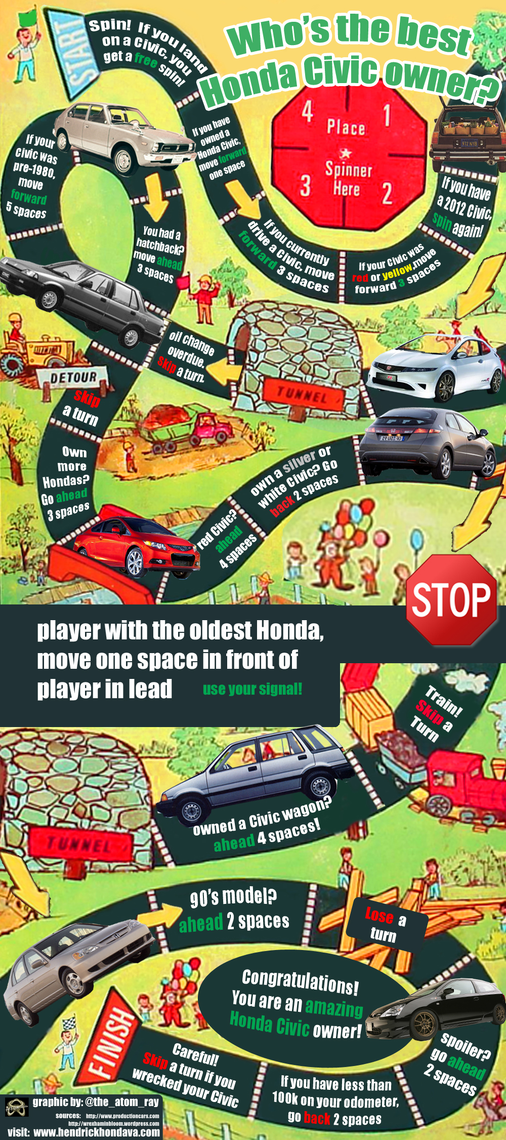
A recent project had me brainstorming graphic content ideas for an auto dealership website. With my infographic history, I was tempted to take advantage of the wealth of automotive specs, price points, and sales figures. Instead of making up charts with these numbers and figures, I created a simple board game, “Who’s the Best Honda Civic Owner”, to encourage Honda Civic owners all over to participate, and keep it fun. In fact, it’s been months since I’ve created a traditional infographic for a business owner.
The Audience Is Listening
Remember that no matter how small your local niche may be in the real world, your online niche is probably already thriving. You can almost guarantee that whatever subject you are interested in, there is going to be a page already on the web somewhere dedicated to the exact topic.
Start networking with these bloggers and curators, share some high quality content with them, and you will be refining your online image as an expert source of information in your industry.
Finally, don’t toss any content ideas aside as too silly. I’m pretty sure that if Mario were marketing his business this year, he would have already created and shared his own Harlem Shake tribute to drive traffic to his site:
As you’re creating multimedia content to market your website today, just remember that if it’s fun for you to make, it will likely be fun for your audience to see.
Sources: http://www.mariowiki.com/Mario_Brothers_Plumbing


