There is no more universal love/hate relationship in business than our unending use of PowerPoint.
When well crafted, a slide deck can help speakers tell a story that inspires their audience. However, the all-too-common response to yet another PowerPoint presentation is a sea of dull-eyed stares.
You’re not alone in looking for the love. As the senior creative manager at PR Newswire, my colleagues often seek my assistance when creating presentations. In addition to providing an aesthetic review, I also find myself guiding them to restructure their stories to improve the clarity, relevance and value to their audience.
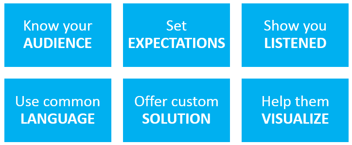
In the first post of this Making Your (Power)Point series, I’ll review my six-step process to creating a presentation that truly caters to your audience.
Know Your AUDIENCE
This is a vital task to driving engagement. In order to make a presentation that is “all about them,” you first have to define “them.” Developing a clear picture of where, when and whom you will be speaking to can shape the structure, tone and formality of your presentation.
Get as much information about the setting of your presentation as you can. What size is your audience? Is it an on-stage presentation, break-out group or conference room meeting? Will there be other speakers, and how will they effect the context of your session?
Find out who will be in attendance. Does the group narrow down into specific demographics such as industry, job roles, and/or experience with the topic you are covering?
Step into their mindset. Are they likely to immediately embrace the ideas you want to share? If not, you will want to add elements to your presentation that will help remove any anticipated hurdles.
Set EXPECTATIONS
Introduce yourself and establish why you are qualified to provide the information you will be sharing. Before diving into the heart of your speech, outline your objectives. In the setting of a business meeting, this may mean setting an agenda. If you’re presenting to a larger audience, consider offering your summarized “conclusion” at the beginning of your talk. In either case, you’ve set a tone and road map for your audience to follow along with you.
Show You LISTENED
This is the first rule of good communication – just ask any marriage counselor.
In preparation for your presentation, you should be asking questions of your audience (and taking good notes) that clearly outline what they need. What are their goals? What obstacles are keeping them from success?
For larger groups and demographics, you can monitor areas of social media where your audience is frequently found. What topics are trending? What questions are being asked? Where is the knowledge gap that you can help fill?
Before presenting your answers, demonstrate that you understand the audience’s needs by reviewing what you’ve heard.
Use Common LANGUAGE
Obviously, the words we choose are powerful in transmitting our message.
As we all should know by now, you’ll want to avoid jargon, which could confuse or distract attendees. When using acronyms, be sure to include a full spelling next to the term when it first appears.
Sometimes there are several different ways to refer to a topic, idea or object. While you may have your own preference, you can more quickly bridge the gap between you and your audience by adopting their preference.
Offer Custom SOLUTION
As we have established, you have listened to your audience and know their goals and/or questions. You should be able to communicate how your idea specifically meets their needs. As you present your solution, be sure you are clearly tying each answer back to its original question or goal objective.
Attendees will be actively filtering the information you are providing into their personal experience. The closer you can present your information to that experience, the easier it will be for them to process and retain.
Help Them VISUALIZE
Images can perk up an otherwise boring barrage of bullet points, but that doesn’t mean you should add generic clipart to every slide. Once your slide concept is finalized, think about visuals that support the message.
- Processes, hierarchies, or lists: Use a combination of simple shapes, colors and text to visually structure your text. For example, if your list of bullets is describes a process, you can use SmartArt in PowerPoint to convert it into a flow diagram.
- Idea analogies: Relate your idea to a topic that you audience already understands. Perhaps there is a cartoon, internet meme or short video clip that can help you both entertain and engage your audience.
- Examples: If you’re presenting a solution that has been implemented before, show what that looks like in action with a photo, screenshot or short video.
Final Review
Using these key components will help ensure you’re putting your audience first in your communication. Having a friend or colleague – preferably someone who demographically aligns with your audience – review your deck will also help you gauge the clarity and impact of your presentation. Besides their thoughts on overall value and relevance, ask them if any areas need further explanation or better visuals.
Stay tuned for part two of the Making Your (Power)Point series, where I’ll discuss tools and tricks you can use to create a more sophisticated presentation deck.

