“Don’t you just love when all of your images get blocked by ISPs?”–said no email marketer ever (unless it was sarcastic).
Luckily, we have ALT tags, which are alternative text tags for images.
What is an ALT Tag in Email Marketing?
An ALT tag is text that appears when an image fails to load. You can think of ALT tags as your safety net. If images don’t download in an email or if the recipient decides not to view your email, the alternative text will show up.
ALT tags are important for the following reasons:
- When an email client doesn’t automatically download images, ALT text gets your message across to the email recipient. In instances when you emails rely heavily on images, ALT tags come in handy.
- In the unfortunate situation where images cannot load due to a bad connection (or alien invasion), ALT tags come in to save the day just like your favorite childhood superhero to provide some context.
- One word: opportunity. Do you like missing opportunities? Me neither. ALT tags can be used to further entice an open, and if you don’t use them, you might just miss out.
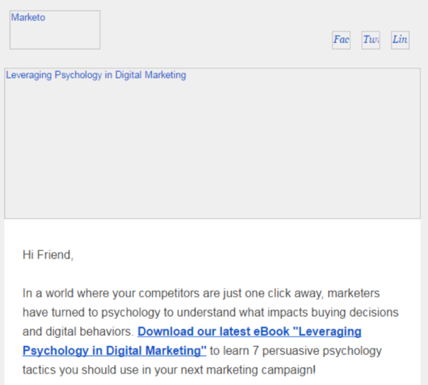
Here’s an example of a Marketo email with ALT text. Although images were blocked on Gmail, the ALT text on the Marketo logo image (top left), the three social media buttons (top right), and the header banner reveal what the images would have shown. Even though these images are blocked, it clearly says “Leveraging Psychology in Digital Marketing,” making it clear to the recipient what we’re offering.
How Do I Create ALT Tags for My Emails?
So what does the ALT text look like on the back-end? Let’s break it down:
<img src=”emailbannerimage.jpg” border=”0″ alt=”How to Leverage Psychology in Digital Marketing” width=”564px” height=”205″ />
To insert ALT text on an image, just insert alt=”YOUR TEXT GOES HERE” after your img src. Simple, huh?
But let’s not stop there. We can style ALT text using inline CSS as well. This is what styled ALT text looks like:
<img style=”font-size: 20px; font-weight: bold; line-height: 205px; background- text-align: center;” src=”emailbannerimage.jpg ” border=”0″ alt=”How to Leverage Psychology in Digital Marketing” width=”564px” height=”205″ />
Let’s break this down:
- Font-size: 20px – Here, we are setting the font size for the ALT text. Normally, it will default to whatever is preferred on that email client, but we want it bigger to catch some eyes!
- Font-weight: bold – This bolds the ALT text.
- Line-height: 205px – This one is trickier and you might need to play around with it. The banner image in this email is 205px tall, so I am making the line-height on this alt-text 205px so that the text is vertically-aligned in the center. Start with the height of the image and see if you like the result!
- Background-color: #5a54a4 – This is one of the most important elements to style your ALT text. When you add a background color, you can keep the look, feel, and branding of your email even when your images don’t display.
- Color: #ffffff – this is the color of the ALT text. Pick a color that provides a nice contrast on your background color and stays on brand.
- Text-align: center – This style keeps your ALT text horizontally aligned within your image.
Here’s the result! Now that looks a little more appealing, doesn’t it?
And finally, once the images are downloaded, the recipient will see this:
And that’s it! With just a few adjustments to your email images, you can have styled ALT text that not only tells your recipients what’s in the email but looks good, too! One more quick tip for you: if you use a marketing automation platform that allows for easy personalization, like Marketo, you can even add tokens into the ALT text to make life a little easier.
So, what other quick tips do you have for using ALT text? Share them below!


