In the marketing world, image is everything! How your business is perceived by your customers is extremely important. Create a bad image, and watch your business go down the drain. But design an awesome image, and watch your business shine! So what does it takes to create a business logo that will knock your business out of the park?
A great business logo can transform your business. It can take it from virtually unknown to widespread recognizability. Large corporations know the power of an internationally-known business logo, and spend million of dollars to perfectly brand their company. To attain that level of success takes years of marketing and branding, but starting out the right way can save your business time and money in the long run. But before we jump into creating your business logo, lets make sure we are crystal clear on the role your business logo plays in your overall brand.
Business Logo vs Business Brand
Many people are often times confused between the two, and tend to clump them together in the same category. Make no mistake, there is a huge difference between your business logo and your actual brand.
Your brand is literally EVERYTHING associated with your business. It’s the idea people have of the overall feeling of your product. This means anything that represents your business, from the employees to the office space, is encompassed within your brand. It’s the marketing, the advertising and the product, itself. Your brand is really the perception people have of your business.
Your business logo is the visual item that is created to identify your business or product. It plays an important part in the overall brand of your business, and is usually what people think of first when describing a brand. For this reason, creating a successful business logo is an extremely important role in your company’s brand.
A Great Business Logo Needs Only 3 Components
There are so many different aspects that come into play when creating your business logo (colors, font, size, design, research etc.), but it basically comes down to these 3 items:
- Simplicity – Is your logo simple and easy to recognize? Sometimes the simpliest of logos turns out to be the most successful:
- Clear Message – Does your logo tell your customers exactly what your brand is all about with one small clue? It’s incredible what 3 circles can accomplish:
- Memorable – Will people remember your logo because it’s distict, unique, or stand-out quality? With some logo’s there’s just something – even it’s simplicity- that makes it stand out:
As you can see, all 3 logos are black & white. In order to emphasize only these 3 main components, all other aspects were taken out for this simple reason: If your logo does not first fit these components, the rest of your work is just creating noise.
Rounding Out Your Business Logo
Now that you know your business logo must possess simplicity, a clear message and be memorable to your audience, it’s time to actually begin designing and creating your logo. With this, there are various factors you need to keep in mind.
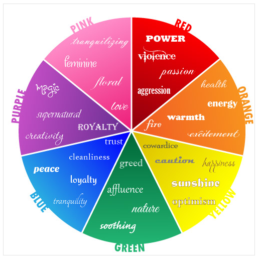
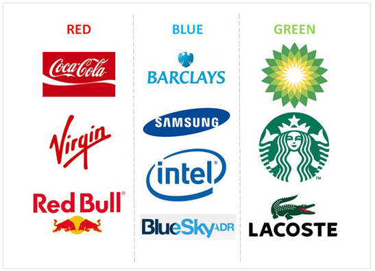
- Color. The examples we looked at earlier, were black & white to prove a point, but the majority of logos are in color. Why? Because our minds respond on a conscious and unscious level to colors — and each color invokes a different type of emotion. As you can see in the color wheel, each color is represented by the type of emotions it brings out in people.
There is no random choice for businesses when they are choosing the colors of their logos. It’s a highly thought-out process with very calculated decisions. Once you understand your audience and type of product you are delivering, choose the color that best represents the type of emotions you are looking to invoke. Take this cool What Color Should Your Branding Be quiz if you’re unsure what color your should be focusing on. - Design. You might have an awesome idea for the perfect design for your business logo, but here’s a tip: Hire a designer. There are some great crowdsourcing sites that design incredible logos. And if you company has a smaller budget, seek out an independent designer that can do the job at half the price of a huge design firm. A designer will know extra details like transferability, pixels, print vs web sizes etc. You want to get it right the first time, so the need to change it doesn’t arise. Once you’ve found the right fit, it can last a lifetime:
- Style. The style of your business logo will tell your customers exactly who you are. The combination of font, color and image should immediately give future customers an idea of what type of business you are. Are you a fun, young company, looking to reach the new generation of consumers? Or are you a more sophisticated, higher-end luxury brand, looking to attract this type of demographic? Depending on your answers, your business logo should reflect that. Let’s look at a few examples:
Toys’R’Us is an example of a company who incorporated their style perfectly inside their logo. Using a kid-type font and bright colors is completely appropriate for the toy store, whereas it would not work for a more serious type of product. With many ideas floating around about why the ‘R’ is backwards (my favorite being that kids first learning to write often write letters backwards), the fact that it stands out and makes it unique and memorable shows us that its purpose was achieved.
Apple is another company who created a logo, and meshed their style with it. Now, the apple logo is so autonomous that it can displayed in any color scheme, and people will automatically connect it to Apple. And if you interested in reading the story behind the logo, you’ll learn where the bite came from.
So now it’s your turn to start creating a little piece of genius. Use the tips we’ve provided and you never know – you might just come up with the next internationally-known icon. We’ve got our fingers crossed.
This post was originally posted on the FaxNgo blog.
