Unless you work with data every day, it’s easy to overlook the importance of visualization. After all, what did a pie chart ever do for anyone? Well, the truth is data on its own is pretty useless until you format it in a way that reveals actionable insights – and you need more than a few spreadsheets to do that.
In this article, we’re going to give you a glimpse of what data visualization can do by taking a single metric and turning it into profitable business insights. More importantly, you’ll get a snapshot of the mindset of our data scientists as they make the magic happen.
Why do we visualize data?
Data visualization is very much a human construct. The data itself doesn’t change just because you put it into a graph, but the way you see it does. We’re visual creatures and long lists of numbers don’t communicate information in the way our brains want to process it.
There are four main reasons we visualise data:
- Digest large amounts of data at scale
- Compare and contrast
- Spot trends and patterns
- Reveal questions that would otherwise be missed
Statistical data visualization dates back to 1628 and this effort from Michael Van Langren to present the distance of longitude between the Spanish city of Toledo and Rome.
Interestingly, the first known graph of statistical data was created to show how poor the quality of data available at the time was. By visualizing this data, anyone looking at Langren’s graph can literally see the inaccuracy of information. A list of longitudinal coordinates on its own wouldn’t make this kind of insight so apparent.
It’s all about gaining insights
The wonderful thing about online marketing is that everything is measurable; with enough data we can now attribute physical shop visits to our digital advertising efforts – we can see if someone clicks an ad and then walks into a shop a couple of days later.
The only problem with so much data is that it’s easy to become overwhelmed. Everyone at Vertical Leap is analysing data on a daily basis and getting insights from this data requires more than formulas and spreadsheets.
You have to visualise that data.
From metrics to insights
To show how visualisation works in modern marketing, let’s look at some real data from Google AdWords. We’ve got a UK business with multiple franchises across the UK and they want to target local people in each area.
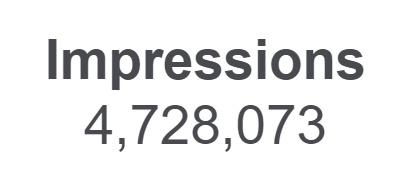
To keep things simple, we’ll focus on one metric: impressions.
Impressions tell us how many times an ad is seen by users. In this case, we’re looking at a branded keyword, so an impression happens when a user types the company name into Google and an ad appears.
By itself, though, this number doesn’t tell us much. In order for us to gather insight from this number, we need to apply dimensions. Essentially, these are parameters that give our data more meaning.
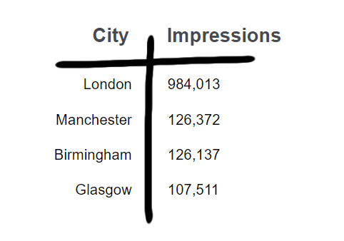
For example, let’s add the dimension ‘City’. In Google AdWords this data is displayed in a table.
We can now see the cities in which our ads appear most often – a far more insightful dataset than a single number of impressions. One simple change has made our data more powerful, but there’s a lot more we can do.
While tables are one of the most common ways to visualise data (you’ll see plenty of these in the AdWords interface), they’re not the most effective approach.
It turns out us humans aren’t too great at analysing data in tables. Numbers themselves aren’t particularly visual; they essentially all look the same when you’re glancing over them. So we tend to look for the outliers – the highest and lowest values – and gloss over the figures in between.
Worse still, we find it difficult to compare rows and columns that aren’t right next to each other. This is problematic when our UK business operates in over 1,000 cities, meaning we’ve got more than 1,000 rows of impressions to work with.
We need a better way of looking at this data.
Data visualisation: moving beyond tables
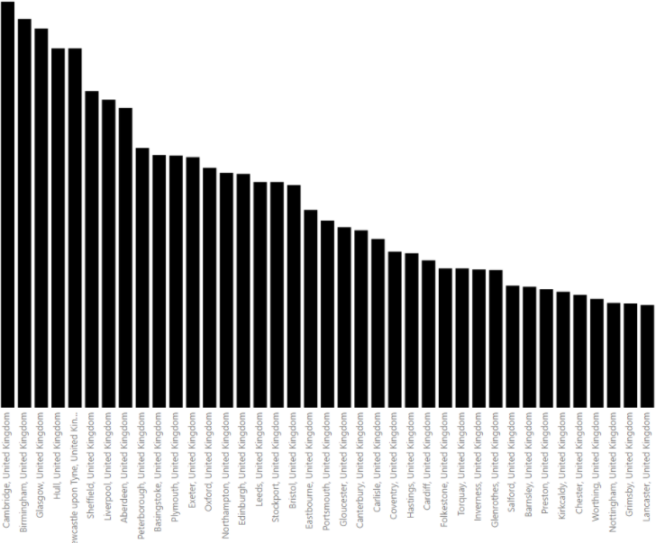
The most basic way to visualise a table is to turn it into a bar chart. Using the exact same data, you can create a chart that essentially converts those numbers into bars, providing a visual representation of a number value. Now you can instantly see which cities are getting the most/least impressions but also how they stack up against each other.
With bar charts we don’t have to worry about number fatigue, skipping over important figures or the challenge or comparing columns at different ends of a table. Simply switching to a bar chart solves a lot of our problems, but not all of them.
Look for flaws in your own data visualisations
As we say, this client has branches in more than a thousand cities across the UK and some of these locations are quite close to each other. In these cases, combined cities can represent visibility in a wider geographical area and this is something we want to be aware of, when it’s applicable.
The question is, how can we interpret this for clients without geographical knowledge of every city in the UK?
Well, we might not be able to do this in AdWords but we can visualise our data in a more sophisticated way by exporting it into tools like PowerBI, CartoDB or ArcGIS – all of which allow us to view geographical data on a map.
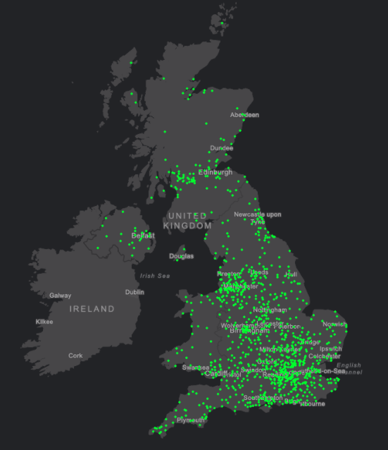
Now we have a complete overview of visibility across the UK. We can see which cities are generating the most impressions but also see where cities combine to create visibility across a wider area. We can visualise this data in multiple ways (heatmaps, pins, etc.) but there’s still something missing here. By visualising our data in maps like this we’ve lost the branch locations – an important dimension.
To get our locations back, we’re going to highlight them with yellow dots and mark our impressions in red. This tells us where our ads are appearing in relation to each branch location and an overview of our combined visibility.
This is a lot better but we can still find flaws in our visualisation. The obvious question to be asking from this dataset is: how far away is each ad showing from the nearest branch? With this visualisation alone, we still have to manually check each location independently and that’s not what we can insightful.
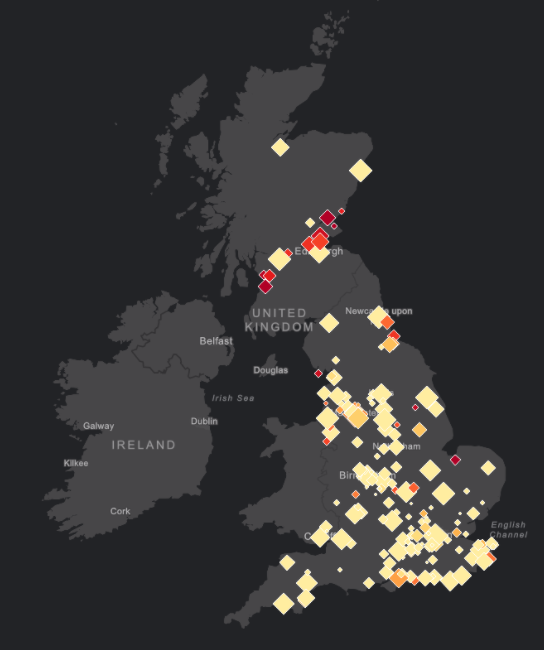
Thankfully, Google has an answer for us. We have the cities where our ads have appeared, and we have the franchise locations, so we can use Google’s Distance Matrix API to find the distance to the nearest franchise for each city.
We can visualize that distance with colour – the redder the dot, the further away from a branch location.
Turning insight into action
The first action that might come to mind when looking at our latest visualization is to pause all the ads in red locations. But these people are searching for our client’s business by name and it’s important we consider the context in these cases. These could be people checking the opening times while they’re at work, for example. People you don’t want to exclude from seeing these ads.
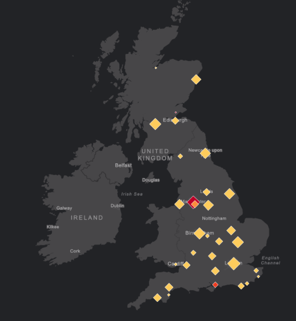
What if we look at this data from a different angle, though? Instead of looking for inefficient impressions why don’t we identify the best location for our clients to open new branches?
If we take out all of the cities with the highest impressions, and we take out everywhere less than 5 miles away from the nearest franchise, we end up with two points: Manchester and Portsmouth. These are two major cities in the UK where our client is generating interest but doesn’t have local branches.
We’ve just managed to visualise our data in a way that reveals these two locations as cities our client should probably be operating in.
Wrapping up
Suddenly, we’ve gone from a single impression metric at the beginning of this article to actionable business intelligence that highlights new opportunities for our client. Which goes to show what can be done when data is visualised effectively and we can even automate this process to notify us when new business opportunities arise.
The key to data visualisation is knowing which questions need to be asked. This tells us the data points and dimensions required but it also helps us determine how to visualise them in a way that makes our data actionable. If we simply stopped at mapping out impressions by location, we would never have reached the conclusion we did today. By constantly looking for holes in our dataset – and what we do with it – we’re able to gain new insights that make a real business impact.
Read more:
