The call-to-action (CTA) is a core component of any marketing effort today, especially within the B2B space. Without one, how do you expect your target audience to do what you need them to do?
Research shows that call-to-actions perform better than AdWords, with the average click through rate being 3.29 percent across all industries, likely due to the increasing number of users running ad blockers.
CTAs are not a one-size fits all deal either. There are channel-specific, audience-specific, and objective-specific best practices. A powerful email call-to-action could make for a VERY lousy social media CTA.
Because your marketing channels all have different purposes for communicating with your prospects, specifying by channel in terms of CTA is critical. Social media is typically top-of-the-funnel messaging, whereas email is middle to bottom-of-the-funnel, so moving prospects to the next logical step down the funnel requires specialization–you don’t want to push prospects hanging out in the beginning of your sales funnel to demo your product before they are ready.
Let’s check out some CTA strategies that can be utilized on four different channels – email, website, blog, and social media – and then outline some ideas to integrate into your own content promotion campaigns.
Email Call-to-Action Strategy
Email marketing is quite possibly the most utilized channel in today’s environment, as 87% of B2B marketers use email marketing to generate and nurture leads.
That also means that your target audience is being inundated with emails from all kinds of other companies, including B2C marketers. Without an catchy CTA within your email, you’re bound to blend in with the crowd and be exiled to the Gmail promotions tab for life.
Your email CTAs can be used to drive readers anywhere–seriously, anywhere. But how are you supposed to stand out and be successful?
Well, it mainly has to do with the location, text, and overall appearance. They need to pop out at readers when they take a quick skim of your email, and have a clear idea of where the CTA will take them.
Fortunately for marketers, there are more options available to us than flashing arrrows saying click me. Let’s explore how to get your audience to take the next step on two types of emails: plain text and graphic/ HTML emails.
Plain Text Email CTAs
Plain text emails are a pretty straightforward concept. They look just like the emails you send to colleagues and friends. No, not like the spam chain mails your grandmother sends you.
This type of email takes advantage of the familiar style we’re used to seeing in emails, offering a message that feels more personal. And while it’s not as attractive and flashy as its counterpart, the personal feel allows for dynamic CTAs that drive real results when done well.
CTAs in plain text emails should fit within the broader style, in that they should be personal, short, and void of marketing jargon.
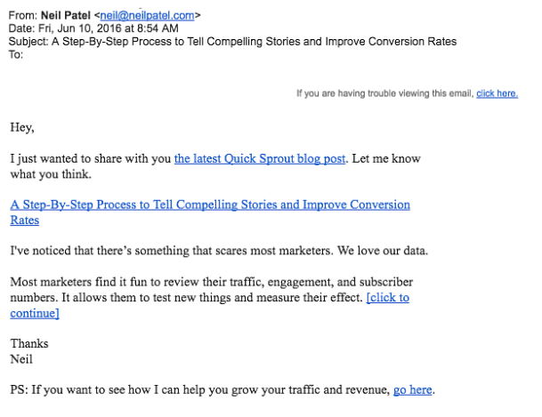
One marketer who excels with plain text emails and CTAs is Neil Patel, a marketing influencer. This email from his subscription list shows how simple CTAs, when positioned correctly, can be used within a plain text email.
Here you can see the CTA is short and written in plain English so it fits in with the overall tone of the email. Neil signs off on his plain text message and almost adds the CTA as an effortless afterthought, giving his audience the illusion it could have come from a friend.
Overall, your Plaintext CTAs should fit naturally into the voice and flow of your plain text message, and be delineated from marketing copy with spacing and light formatting. Take a page out of Neil Patel’s book by trying a P.S. style CTA in your next plain text message!
Graphic/ HTML email
HTML emails, on the other hand, are a much more graphically designed and boast the ability to guide a reader’s attention through a message with images, gifs, videos, icons, emojis, and more!
CTAs in HTML emails are often on brightly colored buttons positioned in the center of emails. Here are your pro-tips:
- Apple recommends CTAs should be at least 44 pixels to accommodate bigger thumbs in mobile experiences
- Whether you’re using a text CTA, an image, or a button, be sure to use vibrant colors for your CTA that will be eye-catching
- While B2C retailers often pack emails with tons of CTAs, but in the B2B world best practice is 1-3 dynamic CTAs that point to valuable content or further campaign touchpoints
For example, Demand Gen Report uses HTML emails with strong CTAs frequently. In this example, they use an animated header image aligned with the webcast name and use text to support to purpose of the email. Their “Blast Off” CTA at the bottom stands out within the first glance, telling me that if I planned to jump aboard the rocket to qualified leads, I needed to click there to do so.
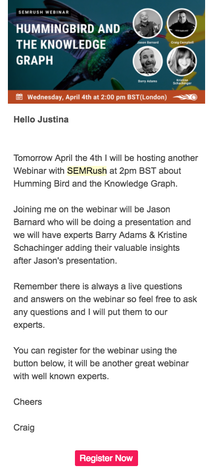
Similarly, SEMRush promotes their upcoming webinar with a little more copy and a static graphic, but follows a similar layout as the one above. Their CTA is more specific, telling readers to ‘click right here to register for this webinar’.
Because people spend on average only 11 seconds looking at emails, in both graphic and plain text emails, marketers need to pack a punch with CTAs to see ROI. Focus on CTA language that is simple and short, and introduces the subject, and is positioned with even spacing that guides readers’ eyes.
Landing Page Call-to-Action Strategy
Landing page CTAs are another, largely underutilized, form of call-to-actions that marketers use to generate leads and get prospects to convert. According to Marketing Experiments, only 48% of marketers build a new landing page with CTAs for each campaign.
Like email CTAs, landing page CTAs can drive users anywhere, but the key with these is to have only one CTA. Your landing pages should have one goal and everything on the page —every graphic, line of copy, and image— has to be aligned around that goal. Cramming two or more CTA in on your page will prevent visitors from focusing on the true goal of the page, which is sure to send your page bounce rates skyrocketing.
Why wouldn’t you want to add multiple and conflicting CTAs? Simply, getting people to your landing page isn’t always easy, so once they are on it, you don’t want to them confused as to which action to take next.
The calls-to-action need to be clear and prominent on your pages. If you hide them or stuff them inside texts and images, visitors aren’t going to know what to do. A good rule to follow is to place your CTA above the fold (visible without requiring visitors to scroll) and make sure its colors contrasts with its surroundings.
You want the reader’s eyes to be drawn to it immediately.
They are need to convey the benefit users will get when clicking as well as use positive determinants. By using positive determiners like “you”, “my”, and other words that express possession makes readers feel as if you are directly addressing them.
Also, much like your spouse during a texting fight, one word CTAs should be avoided.
Bad landing page CTA |
Good landing page CTA |
| Download | Download My eBook |
| Click | Get Your Free Quote |
| Learn | Learn to Juggle |
Another good practice to keep in mind is to imagine what you page would look like without the images and text, leaving only your CTA on it. Will visitors still know what your goal is? The answer is yes, they should.
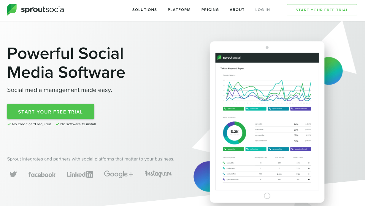
An example of this tip is SproutSocial’s homepage page. Immediately when I arrive on their site, I am drawn to their green ‘start your free trial’, which tells me what I’m going to get when I click on it.
Blog Call-to-Action Strategy
There’s a good chance blog readers have arrived via a quick Google search, social media promotion, or email blast. As they read it, you want them to start thinking about their next steps and how they are going to use the information they’re absorbing.
So why not provide that information to them?
They are likely hungry for raw and impactful content – not a sales pitch. You have whetted their appetite, so now present them with the main course and even some dessert.
Blog CTAs can be presented in two ways: woven into the text as a hyperlink or as a clickable image.
A text CTA looks just like this one; it’s linked to another page that will provide readers with added benefits or additional information.
(Yes, I linked that to our blog because you should totally keep reading them.)
A clickable image CTA, on the other hand, can be a small banner within the text, a rectangular graphic on the side, or a large image at the bottom of the blog.
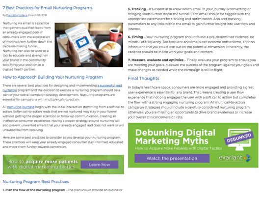
Check out the strong, graphic CTAs used by Evariant, a healthcare CRM software provider.
In most of their blogs, they insert a small banner CTA as well as a lager image at the end. Their CTAs look alike and point to the item as well as follow the one per page CTA rule. Additionally, Evariant aligns their call-to-actions with the blog content.
Great blog CTAs need to offer readers something relatable to the content they are reader as they are obviously interested in that topic. Showing unrelated content will only cause confusion and lead away from the blog’s goal.
Social Media Call-to-Action Strategy
Social media marketing is the most widely used tactic in the B2B space. Roughly 83% of B2B marketers use social media to reach their audience and 54% of those marketers actually generating qualified leads.
With that, it’s safe to say that if you plan to blow away your prospects and stand out in this channel, you need to have a good CTA.
You need to have strong, straight-forward, and highly shareable CTAs, especially if you’re relying on text. Essentially, any request can be considered a call-to-action. If you want them to call you, fill out a form, sign-up for a newsletter, or buy something, you have to tell them.
They can’t read your mind after all.
A call to action should be crystal clear and tell users what you want them to do, like using active words such as ‘like’, ‘follow’, ‘share’, ‘donate’, or ‘subscribe’. You can also create a sense of urgency and need to act quickly by adding an end date or saying it ends soon.
Social media CTAs should also vary based on the network, as their user base varies as well as the ability to add a CTA. Sponsored ads on Facebook, LinkedIn, and Instagram provide spots for calls to action below sponsored posts, whereas Twitter is a little bit more flexible.
MarketingLand’s Search Marketing Expo social account is one that always grabs my attention and clicks. Not only is the content they share relevant to my interests, but it’s actionable and tell me what I need to do. They also tend to include catchy images and videos to stand out in feeds.
Using social media for B2B lead generation is a great idea, but you need to make sure your CTAs designed to do that. Check out GetResponse’s blog for some more tactics.
Final Thoughts
So, before you sit down to write and design a CTA, consider best practices for your channels and create a different approach to generate the kind of leads you need. Don’t be afraid to have some fun with them and remember that it will take some tests to find the CTAs that work best for your audience.

