“This is the age of the customer”. “You need to see the world through your customers’ eyes”. Two simple sentences from a video of Touchpoint Dashboard. I discovered this customer experience mapping tool a few months ago when it was still in Beta. Apart from a quick test, some feedback to the folks behind it and showing it in presentations in Belgium and The Netherlands, I haven’t done much with the tool ever since. But it’s not because I didn’t want to. I know I will use it for future projects and so should you.
Touchpoint Dashboard is a web-based touchpoint and customer experience mapping tool allowing you to map and visualize customer journeys and the different touchpoints for any given business model and all possible scenarios. Even if you already do touchpoint mapping or customer experience mapping (I know, there are other tools but this one is unique), I advise you to look at it (watch the video below to see why).
For the record: I am in no way related to the company just as I was in no way related to Spredfast when they started and I advised you to watch them too. I just want you to work in a more customer-centric and efficient way.
Touchpoint Dashboard has evolved quite a bit since I started using it. Back in October the company also announced an integration with Facebook so brands can use focus groups on the social network (as many do by the way) to comment on their customer journey maps.
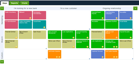
I’m not going to write too much about the platform. You just have to check it out. Very simply said, TouchPoint dashboard allows you to map different potential customer or user scenarios (such as ‘looking for a new bank’ as you can see in the screen shot below from their banking demo) and the various points of interaction (marketing channels, branches, etc.).

Visualizing and detailing touchpoints
For each touchpoint you can define different details such as the name of the lifecycle stage (eg. ‘looking for a new bank’), the touch type (eg. ‘mass media’), performance metrics, whether there’s a moment of truth or not, pain points, etc.
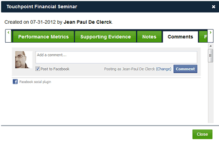
In the detail window of each touchpoint (called the Touchpoint Billboard) you also find the comment feature for Facebook I just mentioned (see screenshot below).
Again, I strongly advise you to give it a go if you want to – and you should – focus more on the customer experience and on different touchpoints.

Even if the tool is essentially about visualization (with reporting, exporting and charting features): it forces you to look at your marketing in an integrated and customer-centric way. Furthermore, it forces you to think – and collaborate. Don’t see it as a replacement of working with buyer personas though. Look at it as a complement, also when you use marketing automation software that has similar features on board.
And, keeping my recent posts on content (and mapping) and on the role of context but most of all the customer reality in mind, that’s the only way to go.
Stay tuned for a more in-depth overview after the holidays and maybe an interview but don’t wait for it and take a test drive today. And in case you’re not interested: just listen to the beginning of the video to remember what marketing is all about.
