10 things I love about Microsoft Surface
I could list 100 things, but 10 is plenty to follow up on my last article about Tablet 2.0. I believed that the Surface and Windows RT/8 would be the next big thing for tablets, and with the launch on October 26th this year, the Surface proved me right.
Number 10 in my list would be the “Desktop”
Many users believed that Microsoft should have kept its original and innovative new UI (User Interface) and moved away from the traditional “Desktop.” The new UI in Windows 8 had a steep learning curve for those who experienced it. However, Microsoft has always focused on ease of use and catering to everyone. In contrast, Apple MAC has aimed at creative designers, ambitious students, and office executives who enjoy the image that comes with using Apple products, leading them to adapt to working on Macs.
For Microsoft Windows, it has always been the next door neighbor. For decades everyone knew exactly what to expect and how to use a computer because Windows has been consistent and it needs to continue to be so. As such, the “Desktop” on “Metro” (what the new UI is called so far) is a top contributor to the continuity of Microsoft operating systems as the simple choice for people of all ages and with all types of backgrounds.
Number 9 would be “The split Window For Multitasking” – Snapping
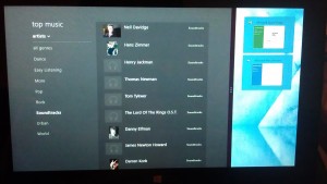
On the new Metro interface, a user can click and drag an application to sit on the side of the desktop splitting the main full wide screen by two third. This action is called “Snapping” and is great with high res. screens, leaving a third on either sides (another creative element to support all users) to show the application currently been worked at as you continue using the remaining part of the Surface screen for other tasks. Metro’s Mojo is “All at once”, or “All at the same time”. With such new features, you can do just that. If you think multitasking must be there any way. I would say, yes off course, however, I am only pin pointing how creative the Surface with Windows 8 has been in emphasizing this basic and main concept.
Number 8 is the “Store”
A read an article about the “App Store” for Microsoft phone 8, originally and now Windows 8, describing it as a “Ghost Town”. Yes, it can be seen as such if we are to compare it with the loads of apps and options we see today on the “Apple Store” or the “Google Play” for Android apps. However, personally I think the novelty of Apps has worn-out to a high level in the last year or so. Basically because it is not about the quantity of the Apps, it is mainly about the level of importance and the need. All the relevant apps are there. The ebook readers, the weather app, the stocks market insights, the latest news, Twitter, Facebook, Skype, Games, and Travel apps. What else would an average person needs. There is enough to satisfy 80% percent of the users and for the remaining 20%, well, get an iPhone or better yet, get an Android, you won’t be disappointed.
Number 7 is Metro
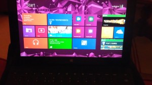
Metro is what Microsoft originally called their new user interface and not sure if the name will continue to be used. However, it is a good reference, and until they release a new name we will call it “Metro”. The new UI is all about having these handy shortcuts on your desktop in a way similar to the original Windows “Gadgets” as they were called in windows 7 or “Desktop Widgets” as they were called in earlier versions of Windows. The cool and trendy aspects of Metro shortcuts to “Apps” is how they leverage touch screens to become more interactive in nature similar to how icons are on new smart phones. So you can simply move them around, maximize, minimize, re-organize, or better yet make them Live. The bottom “Apps bar”, historically the “Task bar” is now a way to control all the shortcuts to “Apps” that are available in the system and you can also make them “Live”. So instead of a simple shortcut to your photos gallery; the shortcut is now a “Live” and active slide show that you can control using the bottom “Apps bar”.
Number 6 the “Charms Bar”
On the right hand side, if you slide from the edge of the screen into the Surface main window, you get the “Charms Bar”, which is a short cut to the new “Start” menu, search across the system, sharing , devices, and system settings. I know aside from the “Start” menu which has always been easy to find in the old interface, having a short cut to the systems settings and the connected devices is a plus. Also, the search is very intuitive, since it automatically searches based on the App that is currently running. So if you are within the “Store” and pull the “Charms Bar” or press “Windows-C” from the keyboard, the search would be filtered to show results of Apps you can install from the “Store”.
Number 5, the one an only “Microsoft Office “
“
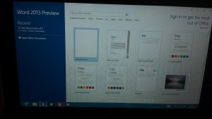
What can we do without Microsoft Office ? Now we get the new and improved 2013 version as well. The Surface Windows RT release comes with Microsoft Word, Excel, PowerPoint, and OneNotes 2013 and users have the option to buy the full package to get Outlook and the other office products. Microsoft office ticks the only box missing from all the other Tablets we see in the market so far. Although in the news lately, Microsoft is planning to release an App for Apple and Android to run Microsoft office. Regardless, this only proves the point that tablets need to take that extra step and become more closer to laptops than phones and this is exactly what Microsoft did with the Surface.
Number 4 is the “Multi-User”
Last year someone handed me their iPhone and asked if I can lock the mail app so their partner would not see their private emails. I simply said, get an Android where you can have more control over the applications and set some security options to lock the app if you plan to share the phone. Which is an issue with all phones and tablets in the market today. One can argue that a phone is personal and we should not even consider setting it for multiple users. But what about Tablets; they are meant to be used by the entire family, or they grew to be so due to the continuing marketing activities from Apple to promote their iPads. As a result, why wouldn’t Apple consider adding this feature and help users lock their iPads and as such provide a different interface for another user to work on the device?
The Surface did, so you have the choice to create a user and login into the system to gain access to your own version of Metro. Or you can create one account with or without a password share across and everyone can use that.
Number 3 is bars every where Top & App Switcher
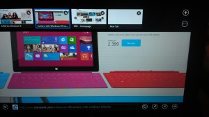
The top bar turns active as well to load more options for the App that is running. So on Internet Explorer, for example, you get to see the open tabs and can switch between tabs or load more of them. One more bar is the left hand side App Switcher, which shows a nice list of the open Apps so you can switch among them. A similar functionality to what we do with “windows-tab” to load the various applications that are currently running on windows.
What I love about Surface is how it utilized all 4 sides of the screen and introduced all sort of shortcuts that are available with a simple slide of a hand.
Number 2 is for sure the “Virtual Keyboard”
Virtual keyboards are nothing new if we are talking smart phones and tablets. However, what I really loved about the Surface was the feel of the virtual keyboard and the various options. So the Surface comes with the standard virtual keyboard as well as a side version where you can physically hold the tablet on both sides and type with your thumb. Another feature of the virtual keyboard is character recognition where you can simply write normally and the Surface would nicely match what you wrote into the application you are using such as Word or any text area within any application.
Number 1 goes to the super slick “Keyboard Cover”
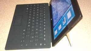
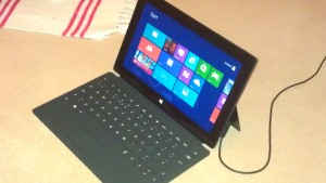
The “keyboard Cover” tops my list; because it is what was missing all along. Tablets coming closer to their place in the market as actual rivals to laptops. Companies like “Samsung” with their “Galaxy Note” smart phones tried to close the gab between phones and tablets. Apple stayed true to tablets by avoiding the integration and thus keeping all its iPads as tablets only and making sure their iPhones are on top of the list of smart phones. So this left the market open for something like the Surface. The keyboard cover is just slick, very thin, no keys actually, nice to touch type on, once you get used to it, and on top of all that is it the cover to protect the tablet touch screen from scratches. The way it also clicks on and off is just a nice touch as well. I have read a story that the sound the magnet connector makes was a vital element of the manufacturing process of the whole thing.
So here you have it, top 10 reasons to consider the new Surface, with more to come with the Surface pro. The Surface with Windows RT as it stands does not have the full features of Windows 8 and it is still using “Nvidia Tegra 3” CPU not the Intel Core i5 which will be with the pro version of Surface. Also more memory RAM will be with the pro version reaching a good 4 GB of RAM and an option for 128 GB of disk space. I can not wait to get my Surface pro.
 “
“