Descriptive statistics are the cornerstone of data analysis. This method provides the researcher with the tools necessary to understand the statistics on hand. It offers insight into the characteristics of data, which is how we can easily interpret large datasets of samples.
Simply put, descriptive statistics is a bridge between raw data and important conclusions. When we summarize and organize a data set based on its characteristics, especially in quantitative research, we have something to work with, something tangible.
If you are tackling tons of data from qualitative research, this post will take a deep dive into how descriptive statistics work and how you can perform this type of analysis.
What Are Descriptive Statistics?
Descriptive statistics take the form of coefficients. We use these to summarize a data set, whether it represents a sample or the entire population. As we analyze grand sets of data, we break down descriptive statistics into different measures (variability, central tendency, etc.)
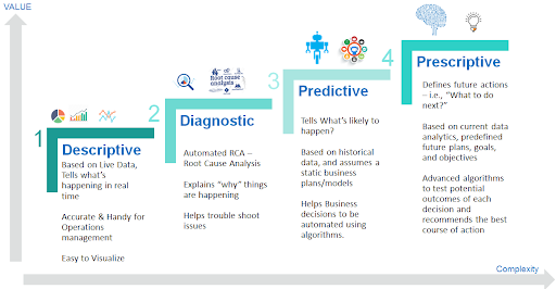
Before we delve into the intricacies of descriptive statistics, let’s take a minute to talk about the different types of analytics. There are 4 main categories that make the analysis process a success, and each of them addresses a different question:
- Descriptive analytics – What happened?
- Diagnostic analytics – Why did that happen?
- Predictive analytics – What will happen next?
- Prescriptive analytics – What can we do to make it happen?

Data analysis is a lengthy and complex process. To have actionable data on hand, we need to take all the necessary steps to analyze it. In a way, it’s similar to the job of the doctor. They start by examining the patient. They use the information to diagnose the problem that causes the patient’s symptoms. Then, they predict what will happen i.e. how the symptoms change or progress over time. After all this is done, the doctor prescribes a treatment.
Descriptive statistics is the starting point of the journey.
Let’s dig a bit deeper into this.
Descriptive Analysis
Descriptive analysis tells us what happened or what is happening. To do this, it uses techniques like calculating summary statistics or drawing visualizations of data.
Let’s say that you own a company and want a revenue analysis. This phase will tell you about the number of sales in a selected period (per day, per month), the variation of sales by store, and the average sale price.
Diagnostic Analysis
After the descriptive statistics are made, you’ll have more questions to answer. You’ll need to know why the data is as is. For instance, if there’s a deviation in sales between stores, this part will show you why it occurred.
At this point, you can relate data to the possible causes, form a hypothesis, and examine the cause-and-result relationship.
Predictive Analysis
Now it’s time to make predictions. Data analytics tells you what has happened and what is happening right now. Using that, you can make predictions for what is most likely to happen in the future.
Prescriptive Analysis
Finally, it’s time to make your predictions and plans happen. At this point, you should have an idea of what you want to achieve, so you’ll come up with possible scenarios where you’ll improve your business’ performance and the data.
Examples of Descriptive Statistics
When you have quantitative data on hand, whether it is from research you need for school or data for your company’s operations – descriptive analysis is the first step to take.
The simplest descriptive statistics example is the GPA. A student’s grade point average takes data points from exams, grades, and classes, and finds an average to understand the overall academic performance of the student.
Types of Descriptive Statistics
There are 3 types of descriptive statistics that you should know about:
- Measures of central tendency
- Measures of distribution
- Measures of variability
Let’s talk some more about this differentiation.
1. Measures of Central Tendency
This type of descriptive analysis focuses on the average or middle value of the data set. In comparison, measures of variability focus on the data dispersion.
The two use tables, graphs, and discussions aimed to help people understand what the data analysis means.
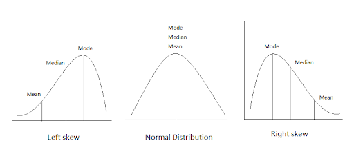
When we analyze the frequency of each data point, we describe it using the median, mean, and mode. These are the 3 ways to find the central tendency i.e. the average.
The Mean
Also marked as the M, this is the method that most analysts use to find the average.
How do you calculate it?
Take all response values and add them up. Next, divide the sum by the number of responses.
Here is an example:
Data set: 8, 5, 10, 4, 12, 6, 9
| Step 1: Find the sum of the response values | 8+5+10+4+12+6+9 |
| Step 2: Determine the total number of responses
|
N=7 |
| Step 3: Calculate the mean
|
M= Sum/N Mean = 54 / 7= 7.71 |
The Median
The median is the middle value, the number that’s set in the middle of the data set. To find it, you need to order each response value by size – smallest to biggest. The median is in the middle.
In case there are 2 numbers in the middle, you’ll need to find the mean of those 2 numbers. Let’s give you an example.
Data set: 3, 8, 2, 10, 5, 12
| Step 1: Arrange the data in ascending order | 2, 3, 5, 8, 10, 12 |
| Step 2: Find the middle number (the median) | 5 and 8 |
| Step 3: Calculate the median | (5+8) / 2 = 13/ 2 = 6.5 |
The Mode
Finally, we have the mode. Note that a data set can be without a mode. It can have a single mode – or more than one. To find this number, you need to look for the most frequent response.
Let’s go through the steps with this example:
Data set: 5, 2, 7, 2, 9, 2, 4, 7
| Step 1: Arrange the data in ascending order (not obligatory, but recommended) | 2, 2, 2, 4, 5, 7, 7, 9 |
| Step 2: Find the most frequently occurring response | 2 |

2. Measures of Distribution
When we measure distribution, we measure the frequency of each value. Any data set is made up of values or scores – distributed in a specific way. Whether you choose tables or graphs, you can use descriptive statistics to summarize the frequency of any value or a variable in percentages – or numbers.
We call this frequency distribution.
To help you understand this better, we’ll show you 2 ways to present frequency distribution – one using numbers and the other one using percentages.
In the first case, the respondents in a study are asked what their favorite color is.
| Favorite Color | Number |
| Red | 56 |
| Blue | 89 |
| Green | 42 |
| Purple | 16 |
In a grouped frequency distribution table, you’ll find that the numerical response values are grouped into ranges with percentages calculated for each group.
| X Product Purchases in 2022 | Percent |
| 0-4 | 6% |
| 5-8 | 20% |
| 9-12 | 42% |
| 13+ | 32% |
Measures of Variability
The third type of descriptive statistics is measures of variability. This type evaluates the response values and shows how spread they are. When we measure variability, we look at 3 things:
- Range
- Variance
- Standard deviation
The range will tell you how far apart are the highest and lowest response scores. Here is how to calculate it:
Data set: 10, 5, 15, 20, 25, 35, 30
| Step 1: Arrange the data in ascending order | 3, 10, 15, 20, 25, 30, 35 |
| Step 2: Calculate the range | 35 – 5 = 30 |
The variance is the degree of spread in your data set i.e. the average of deviations from the mean. Here is how to calculate it:
Data set: 10, 20, 30, 40, 50
| Step 1: Calculate the mean | (10 + 20 + 30 + 40 + 50) / 5 = 150 / 5 = 30 |
| Step 2: Find the deviation in the mean | (10 – 30) = -20 (20 – 30) = -10 (30 – 30) = 0 (40 – 30) = 10 (50 – 30) = 20 |
| Step 3: Square each deviation | (-20)^2 = 400 (-10)^2 = 100 (0)^2 = 0 (10)^2 = 100 (20)^2 = 400 |
| Step 4: Calculate the mean of squared deviations i.e. the variance | (400 + 100 + 0 + 100 + 400) / 5 = 1000 / 5 = 200 |
The standard deviation is the average variability amount in a data set. In other words, it shows how far a given score is from the mean. If the standard deviation is larger, the data set is more variable.
This process goes like this:
Data set: 5, 10, 15, 20, 25
| Step 1: Calculate the mean | (5 + 10 + 15 + 20 + 25) / 5 = 75 / 5 = 15 |
| Step 2: Find the deviation from the mean | (5 – 15) = -10 (10 – 15) = -5 (15 – 15) = 0 (20 – 15) = 5 (25 – 15) = 10 |
| Step 3: Square the deviations | (-10)^2 = 100 (-5)^2 = 25 (0)^2 = 0 (5)^2 = 25 (10)^2 = 100 |
| Step 4: Calculate the mean of squared deviations i.e. the variance | (100 + 25 + 0 + 25 + 100) / 5 = 250 / 5 = 50 |
| Step 5: Calculate the standard deviation | Standard Deviation = √Variance = √50 ≈ 7.07 |
Ready to Do Some Analysis?
Descriptive statistics is step number one in the analysis of quantitative data. It’s the core, the basis on which each of the other steps are based. Often used for making summaries of large sets of information, this is a great way to get an idea of what your results represent.
