Are infographics still relevant? We hear this question all the time. The answer is yes, absolutely, 100%. Infographics have always been—and will always be—a powerful tool to deliver information. By combining copy, data, and imagery, they target the brain’s visual processing center, making content easier to digest (and remember) than text alone. But over the years, the medium has evolved. Today, we’re seeing infographic trends that can help your brand better connect with people, work more efficiently, and make the most of every infographic you create.
3 Infographic Trends to Experiment With Now
Look, we all remember the infographics of the 2010s—the ones that were longer than the Great Wall of China, packed with dense text, and plastered with brand logos. (TBH, you might have come across one last week since plenty of brands are still churning them out.) Luckily, infographics have come so far since then, and they can do so much more. Here are three smart ways to create and use infographics to tell your brand story and support your content strategy goals.
1) Modular Infographics
The classic infographic is a handy way to deliver information, but it’s usually meant to be consumed as a whole. More and more platforms are catering to visual content, but often with dimension restrictions (e.g., Instagram). This makes longer infographics difficult to share on those platforms.
Thus, one of our favorite infographic trends is modular design. This approach makes it easy to extract specific portions of an infographic (such as a chart or statistic) to promote on social media. This provides value on the platform, and encourages people to see the full graphic on your site.
The big benefits:
- Shareability: Smaller sections are optimized for social sharing to extend content’s reach.
- Flexibility: Sections can be used to support a larger story. For example, you might use a single chart to enhance a blog post as well.
- Expanded reach: Different sections can be targeted to different groups of people.
Tip: Microcontent is a great way to expand your infographic’s reach through smaller graphics. Find out why microcontent benefits marketers, and how to make it work for you.
Example: The modular design of this Incapsula infographic makes it easy to break into multiple parts for sharing.
2) Destination Storytelling
Static infographics are the old standby, but interactive infographics can provide a unique and immersive experience. Through a microsite or landing page, interactives let you use every storytelling tool, including copy, images, audio, video, animation, and other interactive elements to bring the story to life.
- If you’re telling a specific narrative, you can craft a guided experience. For example, a clothing brand might use an animated slideshow to take readers through their production process, from the sheep they source their wool from to the wool coat that ends up on a clothing rack.
- If you want viewers to derive their own conclusions, you can present the information in an exploratory experience. For example, a nonprofit that provides clean water might create a complex interactive data visualization that shows water shortage data around the world.
Regardless, this type of destination storytelling puts viewers in the driver’s seat in ways that standard static infographics don’t.
The big benefits:
- More engagement: Readers control the story, allowing them to actively participate.
- Stronger impact: By creating an isolated environment, people focus solely on the story at hand.
- Flexible storytelling: Elements such as video, animation, and interactivity allow the story to be told in more ways.
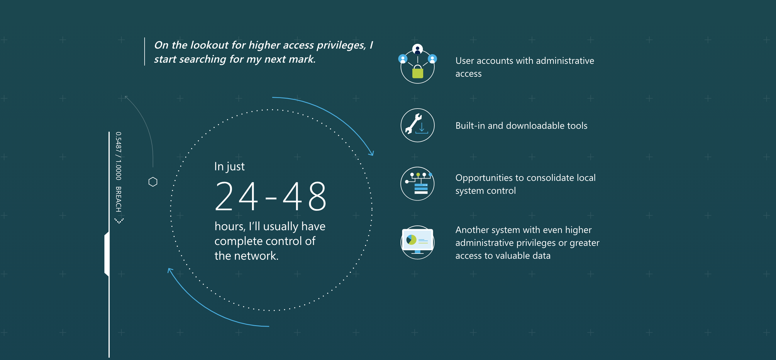
Example: Microsoft details the anatomy of a data breach through a guided interactive infographic, using interactivity and data visualization to walk people through the stages.
3) Divisible Content
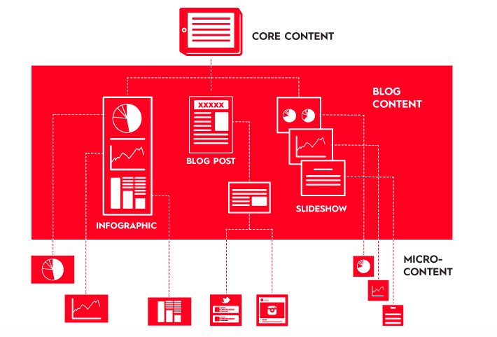
If you’re using infographics in your content strategy, you’re likely creating other content around the same themes, be it articles, e-books, videos, or other social content. Each of these pieces takes energy and resources to produce, but with shrinking budgets and more challenges, these resources are in short supply for many marketers. How do you make the most of what you have? Use a divisible content strategy.
This is a lean approach to content campaigns that gives you a steady stream of content to publish on a monthly or quarterly basis—with less work. The concept is simple. Create a high-value asset (e.g., an e-book), then break that asset into supporting content pieces to promote said asset, and distribute those pieces across your channels.
This approach extends your content’s reach and shelf life while ensuring you tell a consistent, cohesive story.
Benefits:
- Increased value: You get more mileage out of the content you create, helping you improve your ROI.
- More consistency: Content is created as a batch, allowing for a consistent visual style and cohesive message.
- Expanded reach: People can engage with different pieces across a variety of platforms.
FYI, if you want to share these concepts with the visual learners on your team, here’s a handy infographic that covers it all.
How to Make the Most of Your Visual Content
We hope these infographic trends inspire you, but remember that infographics are just one of many awesome forms of visual content that can help you share your brand story, connect with people, and create communities around your shared values. As you refine your content strategy going forward, here are a few things to keep in mind.
- Choose the right ideas. No matter what content you create, it should be interesting and relevant to the people you’re trying to reach.
- Choose the right format.
- Follow best practices.


