Business intelligence is all about the creation of reports and dashboards; but for those new to BI, it can sometimes be hard to tell how they differ in construction and purpose. If it has tables, is it a report? If it fits all on one page, is it a dashboard? Which is better for reporting quarterly totals to a board of directors?
Knowing the similarities and differences between dashboards and reports will not only help you build them more effectively, but also make it a lot easier to tell when to deploy which. Let’s dive in!
What are Reports?
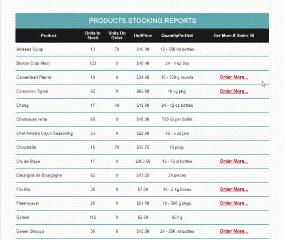
- An inventory report with conditional links to restock low items.
According to Oxford, a report is “an account given of a particular matter…after thorough investigation […],” and that’s as true of BI reports as it is of reports more generally. BI reports cover a particular matter and may use either tables or charts (or a combination of both) to do it. That matter can be wide in scope, like a company’s year-over-year revenue growth over the past decade; or it can be narrow, like an inventory of which widgets were sold in the last five minutes.
Looking more closely at those two examples, you’ll notice that they have something in common: they both try to explain what happened over a given period of time. This diagnostic mode of analytics is very typical of enterprise reporting. Most business data refers to past transactions, and we use reports to “slice and dice” those transactions in search of trends, patterns, and explanations. But reports can also take on a predictive mode, extrapolating those trends to future scenarios.
Sometimes tables are the best way to communicate a report’s main idea. This is typically the case if record details are numerous and individually important. Other times, charts offer a handy visual summary of the trend(s) being presented. Reports commonly contain both.
What are Dashboards?
Stephen Few, a renowned visualization scholar, defines dashboards as “visual display[s] of the most important information needed to achieve one or more objectives; consolidated and arranged on a single screen so the information can be monitored at a glance.” I can think of no better way of putting it.
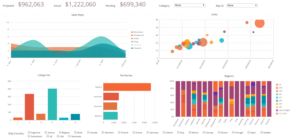
- Dashboard including KPIs (top), filter controls (top right; bottom), and various data visualizations.
The key points to emphasize in this definition are most important, consolidated, and single screen. Dashboards, like reports, cover a “particular matter;” but that matter can have any scope. Like reports, they can comprise both charts and tables. What’s important is that the matter’s most essential details be included on the dashboard, consolidated together, and presented as a whole. The goal of a dashboard is to offer a complete overview of a domain.
But of course, dashboards almost always lead to further questions. Why did that number go up? Where did this new trend come from? The modern BI dashboard, in addition to providing an overview, doubles as a table of contents that links to underlying and related information. That information often takes the form of a report.
Comparing Dashboards and Reports
How They’re Different
Dashboards differ from reports in their design, granularity, and volatility.
Design
Dashboards are designed to be viewed in their entirety on a single screen whereas reports can be any number of pages (or, if viewed digitally, screens) long. There are, of course, grey areas concerning this rule. Some reports can be very brief — a single chart or a single table all one page. Sometimes dashboards take up the full width of a screen but require the viewer to scroll down to see all components.
Granularity
Dashboards contain a collection of charts and tables on a range of related topics whereas reports contain charts and tables on a single topic. As such, dashboards typically offer a high-level overview of a subject, and reports tend to be more granular and narrow in focus.
Volatility
Dashboards are intended to show live information and are therefore often viewed digitally and refreshed at regular intervals with the latest data. Reports, by contrast, are usually consumed in a static format, such as a PDF, and are therefore usually run just once. Dashboards are therefore great for displaying highly volatile data whereas reports are better for data that doesn’t change as rapidly.
How They’re Similar
Despite these differences, dashboards and reports comprise many of the same components and tools.
Content
Both dashboards and reports can feature charts, tables, key performance indicators (KPIs), images, hyperlinks, and/or drilldowns.
Functionality
Both reports and dashboard elements may be filtered, sorted, and — if you’re the author — styled.
When to Use Which
Now that you have a better understanding of what distinguishes reports from dashboards, it should be easy to anticipate what scenarios call for which.
Create a dashboard when you mean to provide high-level insight into a complex system, particularly for an executive or other high-ranking person. Such individuals are often responsible for making quick decisions, and dashboards accelerate time to insight. Dashboards are also useful investigative tools and therefore helpful to anyone in a diagnostic role or situation.
For all other occasions, a report will likely do.
If you’re hungry for more best practices? Download my company’s Dashboard Design Cheat Sheet!
Originally published here.
Read more: Our Top 10 Tips to Create a Beautiful, Attention-Grabbing Report Design

