Bad news: You don’t know your users.
You don’t really understand them, even if you think you do.
When your users fail to convert, do you know what stopped them?
When users ignore your messages, do you know why?
When users kill the app right after your ad, do you know what made them run?
These questions are hard to answer, since we can’t know exactly what users are thinking at every step of the way. It gets even harder when we don’t have enough knowledge about our users. As a result, even the most creative, innovative, and engaging marketing content may end up being ignored.
When users fail to slide their way through your funnels, you may end up trying to guess your users’ most important attributes: their goals, their preferences, their attention span, and even their technical acumen. This is a dangerous trap to fall into, because if you guess wrong, it’ll only result in more failed conversions. Guesswork is also a waste of your precious time. Your time should be spent creating awesome content and brainstorming creative new growth initiatives, instead of staring for hours at a disappointing list of sad KPIs. A better understanding of your users can help you figure out how to make those KPIs bounce back — but where do you start?
The good news: You have an untapped source of qualitative data.
As a mobile marketer, you actually have access to a wealth of knowledge about their users, and it’s right at your fingertips. This fountain of knowledge is qualitative analytics — not just numbers and statistics, but tools that give you an intimate look at your users and how they react to whatever you show them.
Chances are, as a mobile marketer, you or your UX team may already be using some form of app analytics. App analytics should help you answer questions, not just give you piles upon piles of data and expect you to know what’s going on. After all, your users are complicated: they don’t always behave the way you expect them to behave, and they’re insanely impatient about anything they don’t like in mobile apps. It’s pretty hard to read your user’s mind and understand why they do what they do — especially when all you have to rely on is the numbers
Luckily, that’s where qualitative analytics comes in and shows you and your entire team how users interact with your app, live and in full color.
So how do you actually understand your users?
To really understand your users, you need to go beyond the numbers, and into their heads. Now, it’s true that user feedback and user testing can both lead to somewhat skewed or biased results. That’s why qualitative analytics can have so much value for marketers.
With qualitative analytics, you can actually see how your users interact with your in-app initiatives, whether that be ads or IAPs. Instead of ripping apart your messaging/design to shreds whenever it doesn’t get you the results you want, a UX analytics tool with qualitative features can make it easier to step into your users’ shoes and see the real reasons they abandon your funnels.
Instead of relying only on numbers of conversion rates and acquisition metrics, qualitative analytics adds a set of tools that show how users behave and what they do. This rounds out the data you obtain through numerical, quantitative analytics. The purpose of qualitative is to add a more human side to UX analytics, to help you understand your users and your app.
Here are just a few powerful ways qualitative analytics can help you win the Game of Apps by truly understanding your users and your metrics:
Answer your deepest conversion funnel questions
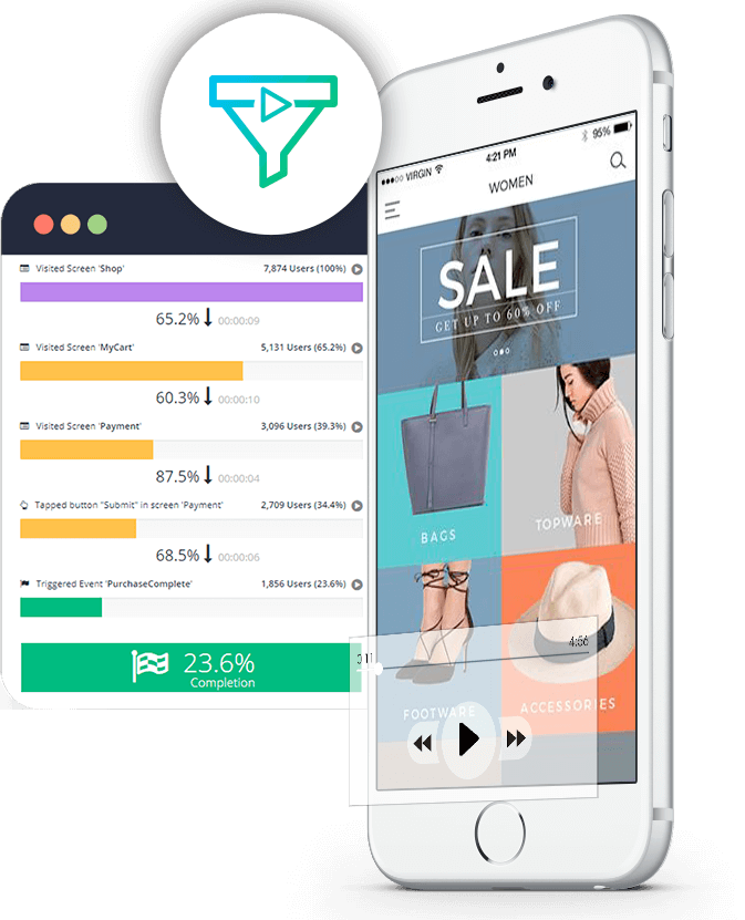
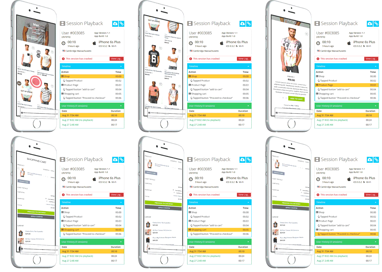
Chances are you’re monitoring your in-app purchases. However, even though it’s easy to see how many user completed or failed to complete an in-app purchase, it’s hard to really understand why. That’s where your funnel analytics can really benefit from qualitative tools such as session recordings. Knowing where users drop off the funnel is only the first step; seeing why they dropped off and what they did later is what will tell you how to actually fix the problem. Session recordings strengthen the power of conversion funnel tools by answering that important drop off question and providing deeper insights into the user experience.
Watch users ignore your pop-up messages
You might be using pop-up messages to ask your users to rate the app on the app store, tell their friends about it, or complete a payment. To analyze why users fail to respond or decline, you’re probably looking at traditional quantitative data, trying to read between the lines in order to understand what happened on each screen. User session recordings can remove that guesswork and give you a deep understanding of what actually happened, breaking down the actions your users made right after the message popped up on their screen. For example, maybe the user didn’t follow through with what the action that the message prompted because the text wasn’t clear or the link didn’t work. Session recordings will show you what users did immediately before and after your message, so that you can figure out what went wrong.
View touch heatmaps to make tapworthy in-app ads
In-app ads are a necessary evil for a lot of mobile apps, but that doesn’t mean you need to give up on improving the ad experience. By tracking down the performance and usability issues that can make ads truly unbearable, you can increase revenue and keep your user happy. However, finding these issues can be hard when all you have to go on are numbers and graphs. That’s where touch heatmaps can be a huge benefit.
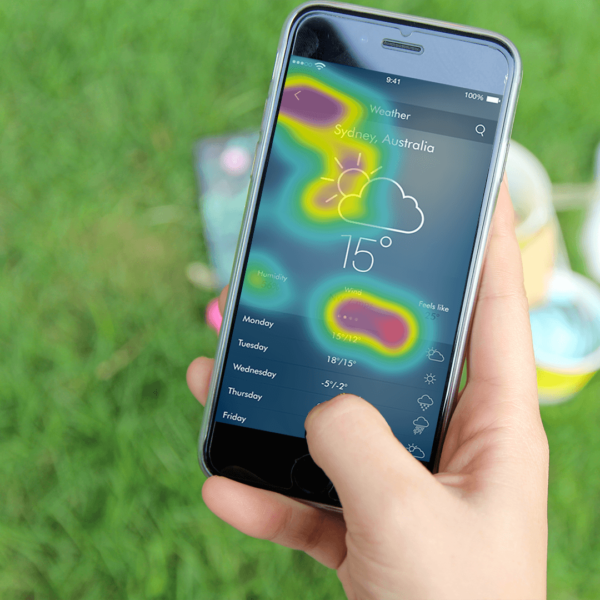
While session recordings zoom in on the single-user experience (which is also powerful), touch heatmaps zoom out and look an aggregate of the users’ interactions with the app. What touch heatmaps do is display a color-coded map (by frequency level) of every gesture your users made on each screen of your app. A lot of the most aggravating usability issues that plague mobile ads can be hunted down and destroyed by looking at touch heatmaps. Broken or missing links, awkward layout of texts and CTAs, and buttons that are too small or disappear on some screen sizes — all of these are easily discovered and dealt with if you’re looking at touch heatmaps.
In summary
At the end of the day, users want one thing — to be happy. A productivity app with a great UX helps the user take control of mountains of tasks or kick bad habits = happiness. A gaming app that responds to the user’s touch will get them excited about finishing that last level = happiness. With the right UX design, even opening a weather app can be a moment of happiness — come rain or come shine.
If you understand your users and what they respond to best, you’ll know how you can give them that happiness whenever they interact with your app. To really understand users, you need more than numbers and KPIs — you need a close, intimate look at what your users do and what they want to do. With session recordings and touch heatmaps, qualitative analytics provides just that, bringing your users into the center of your marketing efforts — where they should always be.


