Whether it’s for marketing, sales, clients, or accounting, every report is created to communicate valuable information. The best reports, however, not only deliver that information but distil it into its most simple, concise package to save the reader time.
You may think you’re already doing this in your reports, but here’s the thing: It’s not just about copy and data. If your goal is to create a report that is easy to comprehend, you should use every communication tool available. That’s where design comes in.
Good report design targets the brain’s visual processing center, helping you communicate more effectively with your reader. Design elements like color, shape, imagery, and visualization make your content not only aesthetically pleasing but easier to comprehend—a huge service to your reader. For example, is it easier to decipher a table of numbers showing month-by-month growth or a single line chart with an obvious upward trend? Line chart, obviously. (Find out more about the science behind visualization.)
Luckily, there are many ways to make your reports more impactful through design.
10 Tips to Improve Your Report Design
We’ve helped all sorts of brands create beautiful, on-brand reports. And we’re here to let you in on a few tricks of the trade. Try these tactics to enhance your next report design.
1) Use color to increase comprehension. Color is a visual cue that helps the brain instantly identify and process information. As such, it’s a useful tool to highlight certain information, whether it’s the highest bar in a bar chart or an important note in text. Tip: Choose a single color to use as your accent/highlight color throughout.
2) Add callouts. Your readers want to know the most important, high-level information from the get go. (This is especially true if they’re reviewing the report on a time crunch or right before a meeting, which happens a lot.) Use callouts to provide important context or identify particularly meaningful insights.
3) Visualize your data. If you don’t visualize your data, you’re doing your reader a disservice. (Again, remember what we said about the line chart?) Unfortunately, a lot of designers think throwing data into any old chart will do the job. No bueno.
Good data design is about increasing comprehension, so it’s important to not only visualize data but choose the best visualization for that data. To do this effectively, learn how to properly design the most common charts and graphs, and follow these 25 tips to improve your data visualizations.
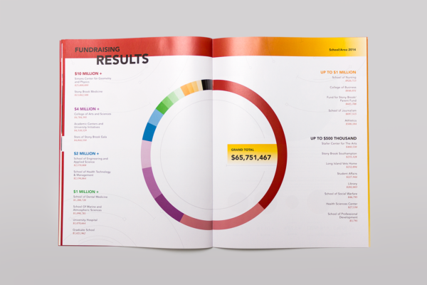
Example: The 2014 Stony Brook Foundation Annual Report used clean, colorful data visualizations to bring data to life and engage readers.
4) Use negative space. Your report shouldn’t be a million pages long, but if all your content is crammed in there for the sake of being “economical,” you’re only giving your reader a headache. Follow the fundamentals of good design and give the eye some breathing room. (Also make sure you’re designing with an intuitive hierarchy to help your reader navigate the content.)
5) Add imagery. This is especially helpful if you’re designing an annual report. An annual report promotes your brand’s mission and values and reflects your brand’s personality. Illustrations or photos can go a long way to communicate your personality, add a more human element, or reinforce a theme. (For inspiration, check out these 40 beautiful examples of annual report design.)
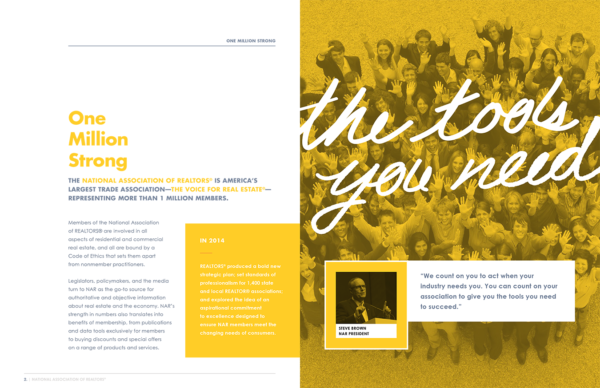
Example: The 2014 National Association of Realtors Annual Report incorporated photography of their team, as well as brand colors, to infuse the report with brand personality.
6) Follow your brand style guide. Regardless of what type of report you’re creating, if it’s a piece of communication your company makes, then it is a reflection of your brand. Therefore, design it acording to your brand identity to maintain consistency and cohesiveness. (If you don’t have a documented brand identity, here’s a rundown of the verbal and visual elements it should include.)
7) Condense content. The great thing about visual communication is that it can use design to streamline information. Reduce your length (and increase that sweet, sweet negative space) by looking for opportunities to let design do the heavy lifting. For example, you might compare two data sets instead of visualizing them separately, or craft a flowchart to explain organizational systems.
8) Play with interactivity. If you are creating an interactive report, you have an exciting opportunity to play around with interactivity. You might use it to provide a deeper dive into a subject or add personality to your piece.
9) Include a simple wrap-up. While this isn’t necessarily a strict design tip, you should take any opportunity to help you communicate more efficiently. Consider ending your report with a simple one-page wrap up featuring key takeaways. This is especially helpful if your report insights will influence decision-making or help you garner support for your cause.
10) Design templates for future reports. This is tremendously helpful to save time, especially with reports that you regularly produce. Design a simple report template that features a variety of elements to mix and match, such as images, charts, headers, and callouts. That way even a non-designer can create beautifully designed reports. (And you’ll rest easy knowing it’s on-brand.)
How to Showcase Your Beautifully Designed Reports
While many reports are designed for internal eyes only, it’s a shame to let work go to waste—especially when you can get more eyes on your content than you think.
If your report tells an interesting story about an industry trend or reveals a surprising insight about your business, it might make a great piece of content marketing. For example, we turned one of our internal marketing reports into a blog post about how our new marketing strategy increased leads 78%. And we’ve been inspired by how these 7 brand turn their reports into content marketing. They might give you a few ideas you haven’t thought about before, too.
Read more:

