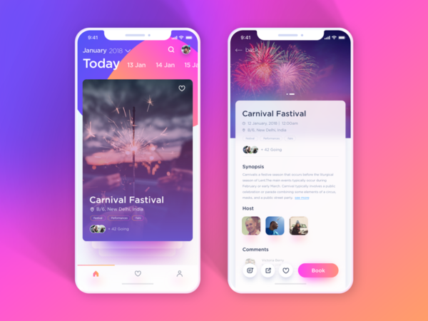
A month has already gone by, and there talks about the trends that designers would be watching out this year. You’ll want to keep these trends in mind if you’re getting ready to launch an app this year so that you don’t get left behind. These include a blast from the past but a more improvised version of course!
Styles come and go. Good design is a language, not a style. – Massimo Vignelli
So, what’s going to be the language of design this year?
Here’s a list of the most anticipated UI design trends for mobile apps in 2018:
- Distraction-free Apps
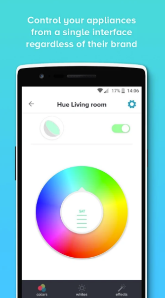
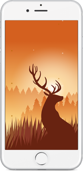
Information overload is quickly becoming a major problem as digital technology keeps users connected to a constant stream of data at all times. It’s gotten to the point where people find themselves doing many things besides the work they set out to do.Distraction-free apps constitute possibly one of the biggest UI design trends in 2018 because this kind of design keeps users focused on a single purpose or action. This has long been a trend in desktop and laptop user interfaces, and it’s now making its way into user’s pockets.You can expect to see mobile word processors and other productivity titles that use this kind of design to keep people focused on their work even while they’re taking a look at their mobile device.UX teams are doing some pretty innovative things with designs including minimum distractions.For instance, Yeti is an app that provides full automation and control of your smart devices with a seamless non-intrusive design. - Redesigned Gradients
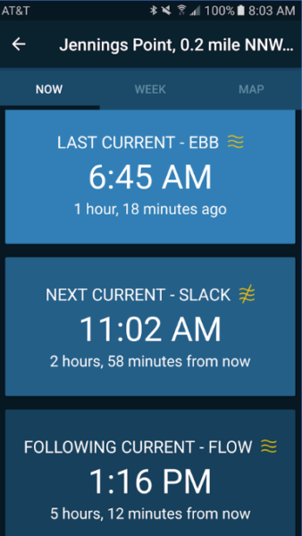
Gradient design is moving in two very different directions. One school of design is making gradients for the user interfaces of both iOS and Android apps that have a retro 16-bit quality to them. This trend takes pixel art to the extreme and encourages designers to individually dictate the utilization of each dot. And also, gives an edge to the OLED displays or the high definition resolution new generation smartphones.The Calm app is one such example of that includes a simple and soothing blue gradient and pictorial natural backgrounds.Then there are apps like Tides Near Me which feature a super flat aesthetic that looks like a gradient reinforced with a single color of different intensities.
And there are apps like TradingView, that looks like a combination of a Murakami Takashi print and a Chromebook’s interface. It certainly has less visual definition than most other investment apps.You can expect a variety of these to grow by leaps and bounds over the next year.
- Transparency
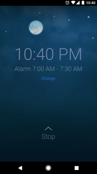
Background transparency is the new fad these days. Different components and interfaces of the app can have an adjusted transparency level. This creates a glassy look and gives a unique feel to the overall design.This technology is being used to layer different parts of a single interface on top of others, which helps to create the interesting visual effects in Sleep Cycle Alarm Clock and other artistic apps like it. - Typography
No app can sway the audience without paying attention to the typography. With mobile user experience gaining momentum this year, designers will be looking forward to different ways to compete over text-based information. Apart from the typeface, most apps might be experimenting with the use of whitespace and content hierarchy according to the devices.The New York Times app continues to set an example of typography done right with fonts that differentiate the category and adequate use of white space making it thoroughly readable and minimalistic. - New Crisp Icons
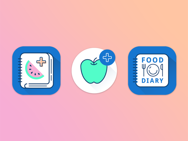
This year, we expect a lot of experimentation with different icon patterns. From simple hand-drawn feel to colorful illustrations, gradient icons to minimal ones, apps will focus on crisp designs that perform well with all screen sizes. While it might seem positively zany to base a new icon set on aesthetics from around 23 years ago, it makes sense because people knew how to get the most out of a low-resolution environment when they made those icons.Graphic designers today are reexamining the relatively small screens of mobile devices and figuring out entirely new ways to use that space. They’re also coming to terms with the fact that excessively large icons can lead to performance problems.Source: Dribble - Muted Color Palettes
Apple’s designers were once encouraged to use color sparingly and only when it would certainly improve the user experience. This year too, a classic combination of muted pastels or black and whites will be trending in mobile app design. This is since subtle user interfaces have proven to create more impact and user engagement.Wildfulness app is an excellent example of UI that uses subtle pastels throughout the app. - Material Design Themes
While flat has been the leader of the pack till date, material design seems to gain more popularity on nearly every platform due to the higher amount of creativity it introduces for designers to experiment with. Going forward, more apps will be adopting a combination of material and flat design to introduce the best of both.The Headspace app illustrates this modern material design scheme well. - Dynamic Illustrations
Custom gifs and illustrations have been very popular in the past year, but in 2018 this kind of paradigm will find a home in mobile apps. It doesn’t come as a surprise that visual stuff gets more attention as it tends to be self-explanatory and engages users to perform the desired action.Mobile app designers will pay more attention to visual details that are dynamic in nature. The buzz regarding micro-interactions won’t fizzle out soon and apps will see a more proactive approach towards this trend in the times to come.Source:Dribble - Touch & Facial Logins
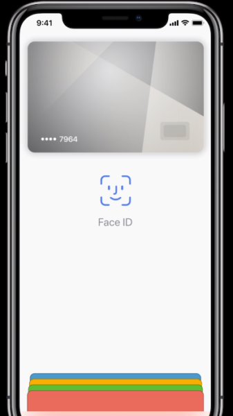
To some degree, touch and facial login technologies are already implemented in Android and iOS as well as in the mobile browsers that most users are already comfortable with. Nevertheless, there’s been an increasing demand for apps that more seamlessly integrate this sort of technology.Many banking, and finance apps have already switched to touch logins by now.Tez, a payments app developed for Indian consumers by Google is a good example of this seamless touch ID login to make payments right away. Also, since Apple has come up with facial recognition technology with the iPhone X, many apps will be resorting to facial IDs as a login feature in the times to come. For now, Apple Pay already has this feature to make cashless transactions easier.Source:Apple You can expect to see many mainstream apps offer users the ability to log into their accounts with their own visage this year.
- Static Menus
If you still think, hamburger menus are a thing – they are not. If you don’t believe it, check out this study by NNGroup on hamburger menus and hidden navigation. Users prefer navigating through visible menus than hidden ones, which is why designers have realized hamburgers are bad for UX.Facebook, Twitter, Spotify and many more apps have already ditched the hamburger and have gone a long way with the static or tabbed menus. This year, mobile apps will gradually revamp to follow this trend of static menus and other UX friendly alternatives. - Audio Interfaces and Smart Device Integrations
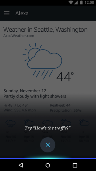
Cortana, Watson, Siri and the other digital assistants won’t be alone in the audio game for long. Mainstream apps are expected to accept more input via audio. Intelligent apps like Lyra have already created a buzz with voice-activated assistance.Apps like Alexa have evolved design thinking to back up smart home devices powered by audio. This year be ready to see more apps joining the league of enabling audio interfaces for smart devices. - Overlapping Cards & Grids
Cards and grids have been well known to generate a personalized experience all this while. This kind of interaction model is a fancy for most designers besides being an excellent content organizer chunking it into distinct sections and making it easier to scan.The paper app beautifully uses gesture-based navigation with 3D cards making the overall design minimal and natural. Mobile app enthusiasts can expect to witness more creativity in this approach.Source:Dribble
