Normally a WordPress theme update is a ho-hum affair. A few behind-the-scenes tweaks, maybe a new feature or two… yawn. That’s not the case with Elegant Themes’ release of Divi 3.0.
Divi 3.0 includes a number of small changes, but there’s one addition that really stands out. It’s called the Visual Editor, and it makes page creation smooth and easy.
Previous versions of Divi offered two ways to build pages and posts — the traditional WordPress editor, or Divi Builder.
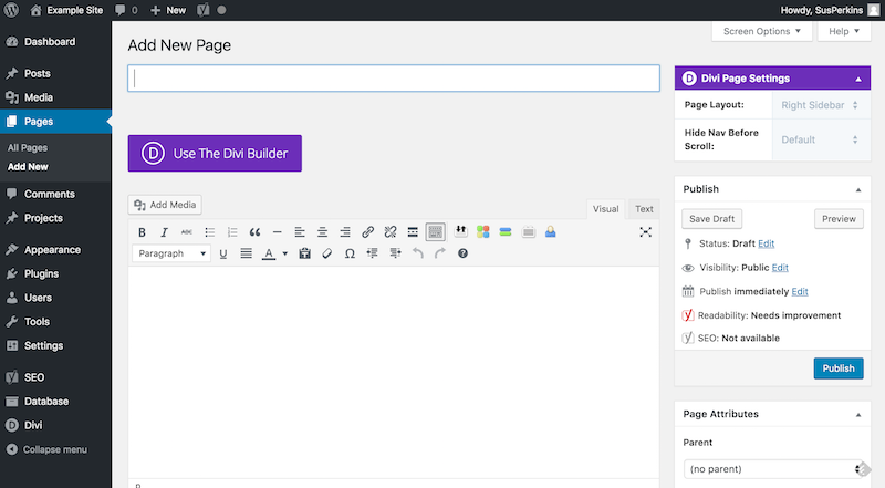
In previous versions, clicking the Add New button for a new page or post brings up this screen.
The big purple button takes you to the Divi Builder, which looks like this.
With Divi 3.0, however, once you click the Use Divi Builder button, you have an additional choice.
What’s the Visual Builder?
The Visual Builder is the biggest change in Divi 3.0.
Normally you create WordPress content in the back end. To see how your page or post looks, you then switch to preview mode. The Visual Builder eliminates the back-and-forth by letting you build on the front end.
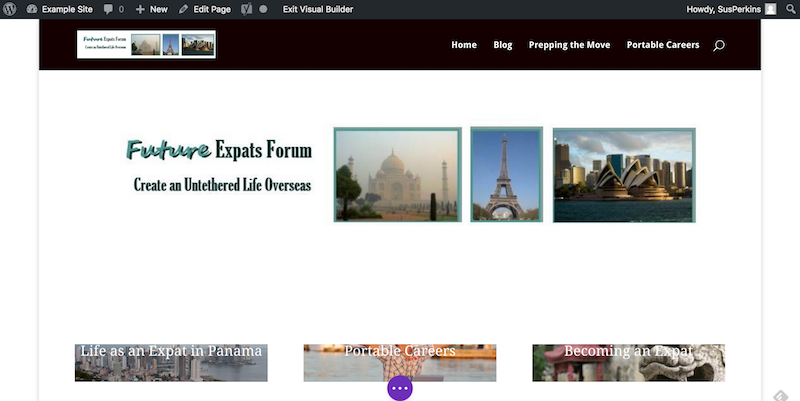
That means, what you see is what your readers will see. You can adjust, edit, add images, etc., in real time, seeing the page evolve before your eyes.
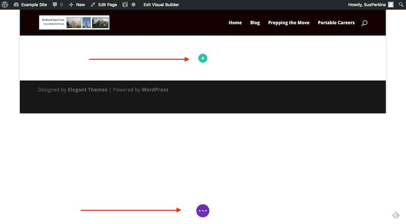
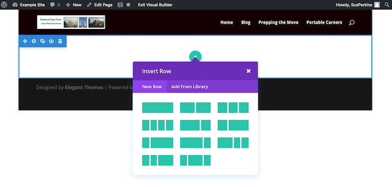
Click the Visual Builder button, and you’ll see a page with only the site’s header and footer. The following examples come from a site I use for experimentation.
Click the green plus sign, and one set of commands opens up. Click the purple ellipsis, and a second set of commands rolls out.
The company’s intent was to make these commands instantly available, but out of the way until you need them. In this, they’ve succeeded.
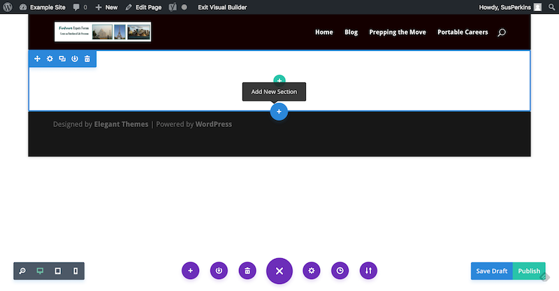
The Divi Builder puts together pages using units, which include sections, rows, and modules. The Visual Builder does exactly the same thing. The blue plus sign adds a new section, the green plus sign adds a row. After you add a row, you insert a module in that row.
Sections
Sections can be
- Full-width
- Regular (called Standard in the Divi Builder)
- Specialty
Each section is color coded: Specialty is orange, Regular is blue, and Full-width is purple.
A full-width section takes the full width of your page. It’s good for headers and for front pages. There are 9 modules available to choose from:
- Code
- Header
- Image
- Map
- Menu
- Portfolio
- Post Slider
- Post Title
- Slider
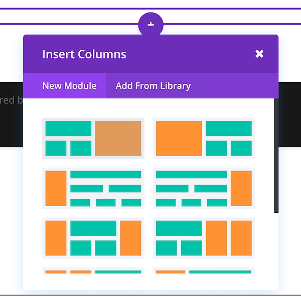
A specialty section allows you to use several different column arrangements within the section. If you want to include a sidebar, this is the section to select as the sidebar (indicated in orange on the grid) will occupy that space for the entire length of the page, just the way a traditional sidebar does.
A regular section allows you to select the number of columns. If you want a sidebar, use the specialty section instead.
Rows
Within each section add one or more rows.
Modules
Modules display the content, which can be text, images, audio, video, or a number of custom post types. The available modules vary depending on which section you’re using. The full-width section, noted above, includes 9 modules.
Both the specialty and regular sections have 37 modules available.
Customizing Is Easy
Add a custom background image or background color to any page, section, row, or module. Change the typography. Adjust margins and padding. Add a background video, or change scrolling to include a parallax effect.
Add custom CSS on a per-module, row, or section basis. It’s easy to add custom CSS sitewide as well, though you don’t use the Visual Editor for sitewide CSS.
Right Click in a Section for More Editing Choices
Right click inside any section, and additional editing tools appear.
Drag and Drop
Another benefit to using the visual editor is that you can easily change margins and padding within sections, rows and modules with a simple drag and drop.
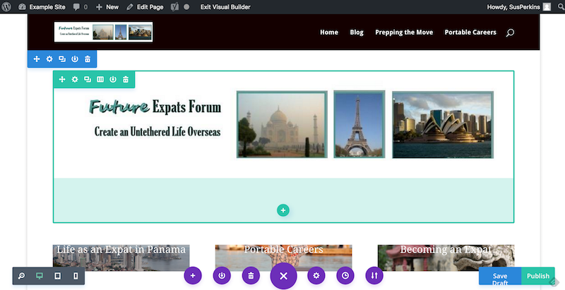
For example, I didn’t like the amount of white space on the front page I was mocking up.
I simply highlighted the top module by hovering my cursor over it. With the section margins showing, I could see there was a lot of padding at the bottom (the light green block).
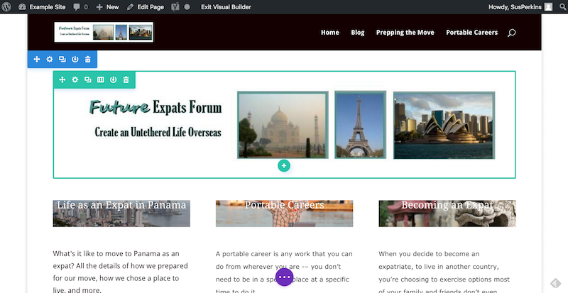
I placed my cursor on the bottom margin and dragged up.
Voila! Extra padding is gone.
What do all those icons stand for?
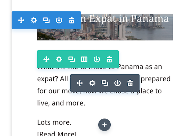
The Visual Builder uses a standard set of icons for editing sections, rows, and modules. They’re color coded to make it a little easier.
- Blue is for editing the section.
- Green is for editing the row.
- Black is for editing the module.
Each set includes five icons, except the green set, which has six.
Here’s what the icons do:
- The first one, the four arrows, lets you move the selected module, row, or section (just click the icon, then drag and drop the selection).
- The gear icon controls the settings for the selected module, row, or section.
- Click the duplicate icon to copy the selected module, row, or section.
- The down arrow copies the selected module, row, or section to the library.
- The trash icon clears that item from the page.
The additional icon in the green icon set (rows) lets you choose or change the number of columns in that row.
Scroll down and look at the icon set in the lower left-hand corner of your page. (If you don’t see it, click the purple ellipsis to expand those icons.) You can view the page in computer, tablet and phone views, to see, in real time, how the page will look on different devices.
In the lower right-hand corner are the buttons to save your draft or publish your page. In the middle, click the big purple X to show or collapse the expanded view.
- The purple plus sign will load a new page layout from the library.
- The down arrow saves your current page layout to the library.
- Trash will clear the current page layout.
- X collapses the settings.
- The gear icon opens up page settings.
- The clock shows editing history.
- The double arrows let you export your page settings as a JSON file to use on another Divi-powered site.
Customize the Visual Builder Interface
Last, but not least, you can customize the interface itself so that it meshes with your working style. Drag the edges to enlarge or shrink it, or drag it to a new position on the screen.
Look at the two icons in the upper right-hand corner of the Settings editor, for example. The one on the left will expand the editor, the one on the right will roll it back to its original width.
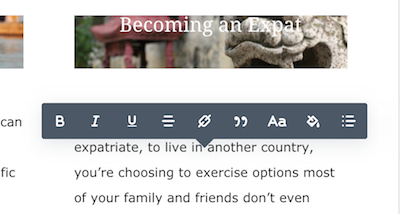
Want to edit some text? Just click and start typing. At the same time, a text editing flyout appears, letting you easily apply bold or italic, add a link, change text color, or make other changes.
If you need to revert to the original Divi Builder, click the Edit Page link in your admin bar (remember to save first!), and you’ll see the traditional Divi Builder editing screen.
Click Use Visual Builder to return to the Visual Builder.
While I haven’t had a lot of time to use the new Divi 3.0, I’m pretty comfortable with it already. If you’ve used Divi, you should find the Visual Builder intuitive and easy to use.
If you’re starting out with Divi, it might be helpful to experiment with the traditional Divi Builder first. Once you feel comfortable building a page with sections, rows, and modules, then switch to the Visual Builder.
Either way, Divi 3.0 is a powerful page builder, and the visual interface makes it a joy to use.
