In my article titled, 10 Tips for Split Testing Email Campaigns, I touched upon “Calls-to-Action (CTAs).” In email marketing, as well as online marketing, there are a number of important elements associated with CTAs you can optimize to improve your click through rates (CTRs) and responses, or get your subscribers and visitors to engage in some other meaningful way. These include the words you use to issue the commands (actions), their physical appearance (color, design and scale), and placement (location, location, location). In this article I’m going to discuss how to create effective CTAs to grab the attention of your subscribers and prospects, and provide some examples of effective calls to action.
Best Practices for Effective Email Calls to Action
CTAs are one of the most useful tools in guiding your subscribers to take immediate action or leading your subscribers to the next step. In an email, the CTA can be hyperlinked text, a clickable button or image that solicits a desired action from a reader and then redirects them to a landing page that provides additional information. It’s an easy way to interact directly with subscribers and prospects and promote engagement with the content of your email to help extend your interaction with subscribers beyond their inbox (e.g., while they are visiting your website and blog, engaging with you via social media, etc.).
1. Entice with Clear Commands & Cues
Don’t rely on “click here” as a command—it falls far short as a call to action. We all understand that a button or link is our visual command (cue) to take action. The trigger to entice the customer on the path to conversion must be clear, compelling, and deliver as much information as possible in just a few or couple of words. You may want them to subscribe, download a white paper, purchase something, register for an event, or share with their friends. Keep it simple and clear!
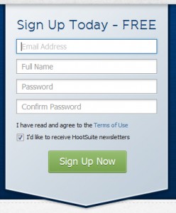
Example: HootSuite’s simple CTA makes it clear that the sign-up process is fast and easy.
2. Use Verbs to Convey Action and Urgency
A good call to action accomplishes two things:
1) it tells the subscriber or visitor exactly what they’re getting when they click on something; and
2) it gives them a sense of urgency and immediacy.
Use a command that clearly states what action you want them to take. Which are you more likely to click on: “Click Here” or “Get it Now!”? Would you be more enticed by “Download” or “Download Now, Free!”? Creating a sense of urgency entices your readers to act quickly. Of course, when the action is less urgent, you’ll want to us use a call to action that works better in your overall site design or email (e.g., “Learn More,” “See How It Works,” etc.). Ideally, you want to start your CTA with a verb.
- Download Now, Free (Download Our Free eBook Now!). People like free downloads and respond to immediacy. These deliver on both.
- Save 20%. You’ve enticed your subscriber with a discount.
- Join Now. Great for membership and social network sites.
- Talk to an Expert. This is a great CTA, if you have any kind of authority site on a subject in which people would want to talk to an “expert.” Also provides more credibility.
- Call for a Free Quote. This is great for anyone that provides pricing quotes. Combine it with useful information about your services.
- Start Your Trial. Let users experience what they’re buying before they buy it. Trial periods are a great way to lure prospects. It’s not too committal and people can form their own opinions by trying your product or service. [View 14 additional call to action phrases here]
Example: “Try it for Free” – FreshBooks eliminates use anxiety with a free trial offer.

3. Be Bold with Color & Contrast
Use attractive colorful buttons with visual styles that compel subscribers and visitors to take action (e.g., arrows signify forward movement). You want to draw your subscribers and visitors directly to it, and the best way to do this is by using color and contrast in your buttons. The color of your button should contrast with the text color on your button. Be sure to test some variations to ensure it’s as effective as it can be.
Example: Spotify’s neon green CTA contrasts sharply against the light gray background.

4. Draw Attention with Size & Whitespace
Experiment with button size (e.g., a smaller button may get lost, but make it bigger and it becomes a central element on the page). Try increasing the font size and use ample amounts of white space to offset it from the rest of your content. White space has nothing to do with the color “white”— it is the empty parts of the page. If the page has a different background color, that will be the color of the white space. Good use of whitespace can help readers make visual connections between page elements, and it can also differentiate a CTA as a stand-alone important element.
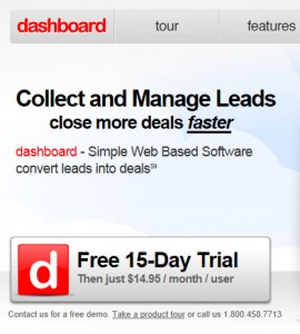
Example: Dashboard’s red and black CTA is highly visible and offers additional information.
5. Minimize the Number/Prioritize Multiple Calls to Action
There are instances when two or more calls to action are appropriate. For example, if you have two calls to action like “Sign Up Now” and “Take a Tour,” you may want the focus to be on free trials. In other instances you may want to let customers choose which path to take on their own. You can either increase the size of the most important call to action to make it stand out, make use of color to highlight the most important button, or make both calls to action the same size and spaced equally, but guiding the user to a specific button through the use of color.
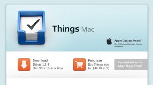
Example: Things calls to action are of similar importance and are identical in shape, size and color.
Example: planHQ makes good use of white space to accentuate its multiple CTAs.

The above calls to action buttons are stacked—the neon green primary desired action (“Sign Up Now”) is on top of the blue secondary desired action (“Take a Tour”). Unfortunately, in this example the user is drawn to the blue “Take a Tour” button with bright orange “Watch the video” text, making it look like the primary desired action. Notice the use of whitespace used to create a logical grouping of the three related elements that can help make the sale: Get a Plan; Get it Done; Get Better.
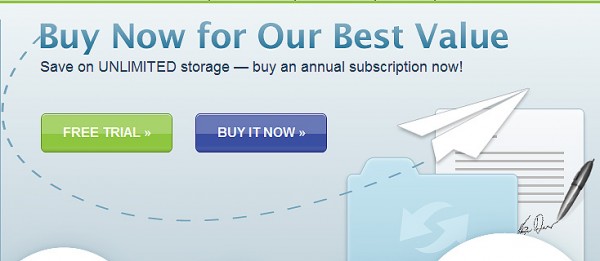
Example: YouSend It uses a bright blue for its primary CTA; the clear focus is on “Buy It Now” (as stated in the text above) rather than the “Free Trial.” However, they give the user two options.
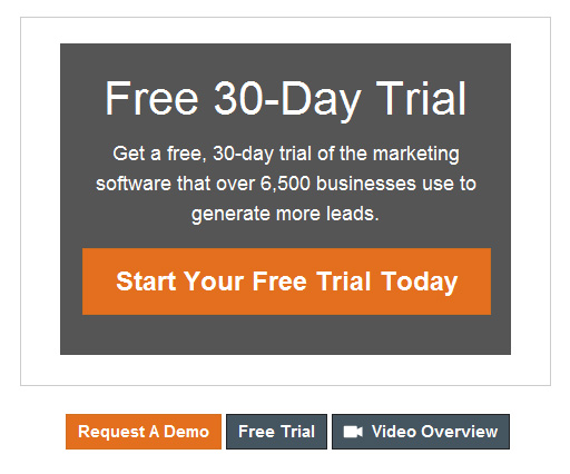
Example: Hubspot’s orange CTA pops against the gray background; they make good use of white space and color to call attention to their secondary “Request A Demo” call to action.
6. Create a “Bulletproof” Button using HTML
A “bulletproof” button is a button in your HTML email that looks the same regardless of whether the recipient has enabled images or not. It is estimated that approximately 35% of email recipients block all or some of their images; and, by default, several popular webmail services and email clients, such as Google and Outlook, are set to disable images automatically. This can be particularly critical with respect to image-based CTA buttons, since your image-based button may be hidden or not displayed at all. Even if you’ve used an image Alt attribute and image title, this may not be enough to get a user to click.
If for brand or design purposes it is necessary to include a graphical button as your call to action, you can compensate for image blocking by achieving a “bulletproof” button-like effect through a technique that uses table cells with HTML text and appropriate colors and styling.
Place the HTML text within a table cell that has a colored background (indicate this color by using the “bgcolor” attribute in the <td>). In the example below the code will generate what appears to be a graphical button labeled “Download Now, Free”:
<table cellpadding=”0″ cellspacing=”0″> <tr>
<td align=”center” width=”160″ height=”24″ bgcolor=”#4E91CD”>
<strong><a href=”https://www.netatlantic.com/resources/email-marketing-whitepapers.html” style=”color: #FFFFFF; font-family: arial; font-size: 14px; text-decoration: none;”>Download Now, Free</a></strong></td>
</tr> </table>
Image Version
| Download Now, Free |
Text/HTML Version
No part of the Text/HTML version above is an image. It was created entirely with text and HTML, neither of which is blocked when images are turned off (disabled). Go ahead, highlight it by dragging your cursor across it and you’ll notice that you can actually select the text on it!
7. Make Easily Visible Above and Below the Fold
CTA placement is a key area to look for improvements. Make your call to action easily visible to your audience. The placement of the CTA within an email or on a web page is critical to attracting the eyes of subscribers and visitors. Placement can lead to higher click through rates and higher landing page conversions because users will likely notice the CTA and take action. Place your primary call to action button, image, or text link “above the fold,” where subscribers and visitors can see it without having to scroll down. However, if your page or email allows for scrolling, include additional calls to action so that each screen’s height contains one or more that are logically presented.
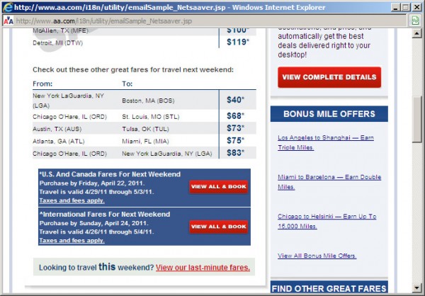
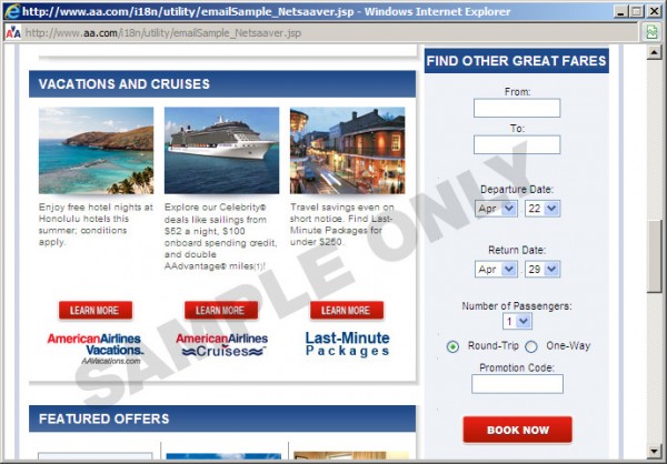
Example: American Airlines uses red buttons that pop against their light blue background; as viewers scroll down the page, they find additional calls to action within each screen.

In this particular example, American Airlines gives the user multiple chances to clickthrough. However, keep in mind that the more decisions you ask users to make, the more they may not make any decision at all! When it comes to multiple calls to action, my advice is to keep the number of actions to a minimum in your email. After all, one clickthrough is better than no clickthroughs. If you ask a user to choose between many different options, you may find that they choose none at all.
8. Optimize for SEO
In many cases a button is directly linked to a page indexed by search engines. By adding an <img> alt attribute, you’ll provide the search engines with text they will then associate with the target page: if you are targeting keywords on that target place, you should use them in your <img> alt. To get the most out of your button, your image’s alt attribute (or, depending on the browser, an <a> title attribute) may be displayed to a visitor when they mouse over the button, providing yet another opportunity to reinforce or your call-to-action (“Reserve a Spot Now!”).
9. Guide to Next Steps
What do you want them to do exactly? Will they need to complete another step or two? If so, let them know up front–no surprises! You may even want to show them a step progression. CTAs should guide your subscribers or visitors to take the next step or complete a specified action, whether it’s to download a white paper, register for a webinar, click through to your video, landing page, or shopping cart. People like being guided to next steps, and calls to action give them the opportunity to act without having to think about what their next action should be (e.g., “Register Now,” “Tell us what you think,” “Watch the video,” “Learn more,” “Download White paper,” “Add to Shopping Cart”). If you make it easy for the user to understand where to take action, why to click through, and what to expect once they click through, you’ll see your CTR increase.
Example: Net Atlantic has used a “Sign up now” text link as the primary call to action.

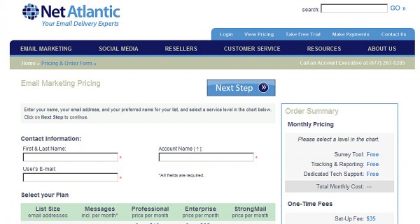
Example: Net Atlantic’s landing page clearly lets the user know there are more steps to complete.
10. Split Test Call to Action Buttons
The key to knowing which call to action was most effective at driving traffic to your landing pages is through testing. You can significantly improve results, by making the smallest tweak. Moving the CTA up further in the email or page may produce more click throughs and higher conversions. Simple design changes (color, text and size of button) can produce impressive results. Until you test the call to action, there’s no way of knowing whether you have chosen the best option.
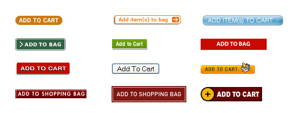
Example: Split Test by making simple design changes (color, text and size of button).
Summary
In a nutshell, there are many factors that influence the conversion rate of a call to action button, including language, color, design and placement. Since the CTA moves people to action, be sure to include verbs in your CTA copy. By paying more attention to this very important element, you’ll prompt readers to take action and make your email marketing campaigns more effective in driving conversions, no matter what the conversion might be (e.g., purchases, donations, subscriptions, registrations, reservations, etc.).
