Have you ever needed to ‘pinch and zoom’ to resize content while doing some online browsing on your phone?
It’s likely that you’ve landed on a non-mobile-optimized page and quickly left. It’s a frustrating and disappointing experience—text is hard to read, images are hard to click, and buttons and links are nearly impossible in an unoptimized experience.
Now, think of your website. Imagine someone landing on a page on your website only to realize that it’s not optimized for mobile. It’s unlikely that user will be staying long on your website, let alone purchasing something. This makes it crucial for you to optimize your mobile landing pages for conversions.
Reasons to optimize your mobile landing page
Statista reports that there were over 120 million mobile buyers in the U.S. alone in 2015. By 2019, that number will significantly increase to 162 million.
In an IAcquire and Survey Monkey study on mobile shoppers behavior, they found:
- 70% of mobile searches result in action on a website in just one hour
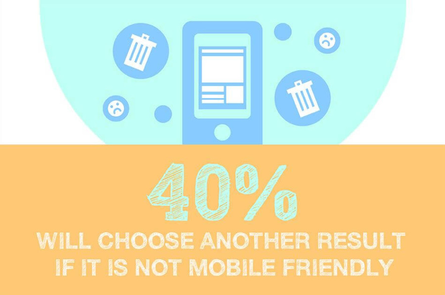
- 40% of users will choose another result if their first choice isn’t mobile friendly.
Your visitors know they have choices, so they wouldn’t hesitate bouncing from your website if it doesn’t provide them with a pleasant and useful experience.
Tips to create a high-converting mobile landing page
The above data suggests that you can’t afford to ignore mobile optimization for your landing pages. So how exactly do you optimize your mobile landing page for conversions? You could get started with the basics that have been implemented by experts in the digital marketing world. Take a look at the tips below:
1. Optimize page load speed
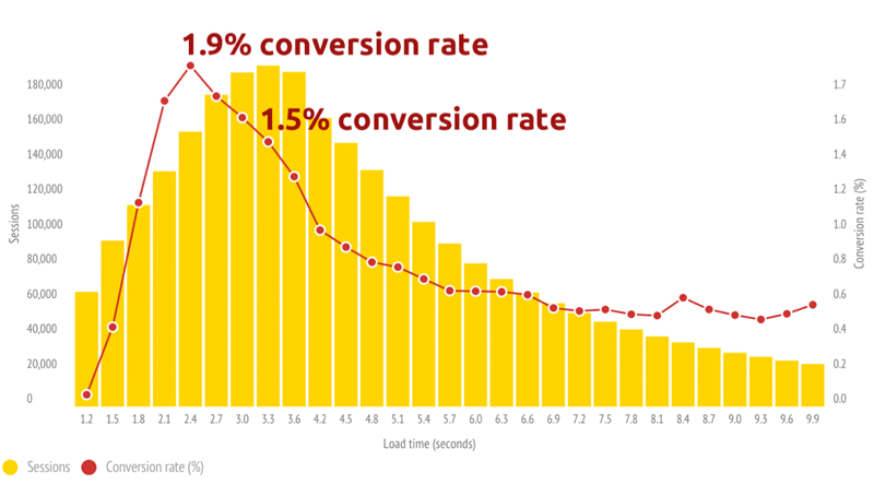
Slow loading pages can easily bore users. You want to capture their attention instantly with your offers. So you will need to reduce the time it takes for your mobile landing page to load. Even a one-second delay could have a serious negative impact on your mobile conversions.This is clearly proven in a case study conducted by Soasta. In the study, pages with an average load speed of 2.4 seconds had a conversion rate of 1.9%. This is a respectable rate considering the fact that desktop conversions average 2-3%. Pages that load one second slower experienced a 27% decrease in conversions.
There are several ways to increase the speed of your mobile webpage. You could start by optimizing the images, which means scaling them to the right size so they don’t slow down your page. It’s also possible to reduce your HTML and CSS files by enabling compression, which can reduce their size by 50-70% (source: Varvy.)
Flash and other plug-ins can slow down the load speed of your page to a significant extent. Sometimes, these elements may even be incompatible with a user’s device, so you should refrain from using them at all cost. Your goal should be to keep the size of your mobile landing page at around 20 kilobytes.
2. Minimize distractions
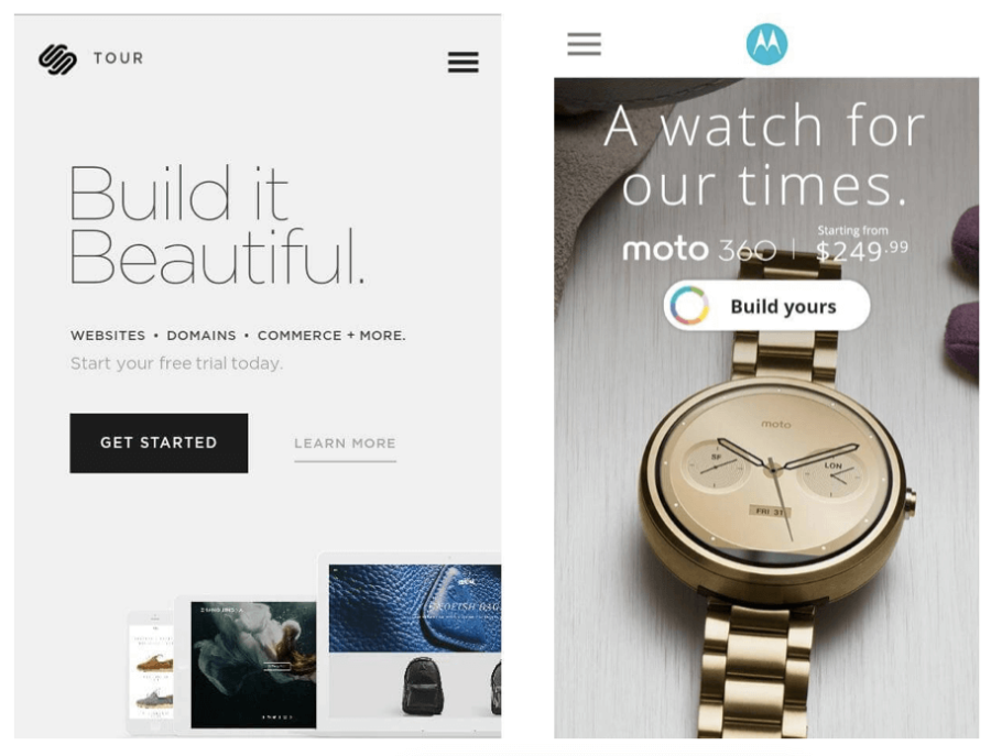
Whether you’re building a landing page for mobile or desktop, it’s easy to get carried away with the imagery and text. You might end up filling every pixel of white space with distractions. When there’s so much going on, you might end up chasing away potential customers. The entire focus should be on your CTA button and headline, so keep it minimal. Image-heavy pages could also take a longer time to load, making it another disadvantage.Take a look at the example below from SquareSpace. You can see that the design and layout is neat and minimal. There’s significant space between text, imagery, and other elements. This is good use of white space, as there are no distractions. Users directly see the headline and the CTA button is highlighted clearly as well. So page visitors will know exactly where to go and what they need to do.
3. Write a strong and short headline
You already know that headlines on a landing page should be short. With mobile landing pages, you need to keep your headlines brutally short. If possible, try to make it around five words or fewer. If you’ve already written a draft, take a second or even third look at it. Cut out any unnecessary words, such as product descriptions; you can get into the details of your product later on.
All your mobile landing page headline needs to do is give your visitor an idea about what your product does. The mobile landing page for Motorola’s Moto 360 is a good example of this. And as you can see in the image to the below from Squarespace, they’ve kept the headline within five words and included only the most important details. You can see the name of the product and price. The CTA button is clearly displayed and tells users a bit more about the product. “Build Yours” suggest that the watch is something they can customize for themselves.
These mobile landing pages are light on product descriptions, with compelling and short headlines paired with simple button CTAs.
4. Make your phone number clickable
What do users do if they have any question about your product or service? They’re going to need a phone number to contact you. It’s a hassle to copy a phone number from a website and constantly switch between a browser and a dial pad. When building a landing page, you need to emphasize on convenience and usability: make it more convenient for visitors to contact you by making your phone number clickable. While adding a clickable hyperlink could help, it’s still easy to misclick a line of text. Try designing your contact number in the form of a button, which will add extra padding around the clickable element (see the example below in Timber Mantels‘ mobile webpage.)
5. Optimize your call-to-action (CTA)

Take a look at the example from Shyp‘s mobile landing page to the right. You can immediately see the CTA button, which is highlighted with a darker background. While the headline is also prominent, the main focus is on the call-to-action. It’s short and clear while being persuasive. There are also no distractions on the page and the design is minimal.
6. Test your mobile landing pages
How do you know whether the changes to your mobile landing pages are working, and which of them you should keep? Running an A/B split test or a multivariate test is an essential part of building a successful landing page for both your mobile and desktop website experiences. Comparing different versions of your landing page will help you understand what works and what doesn’t for your unique audience. Not every change will have a positive impact: maybe your CTA copy isn’t converting as well as you expect it to. Testing gives you an opportunity to try out other changes that could positively impact your goal for the page.
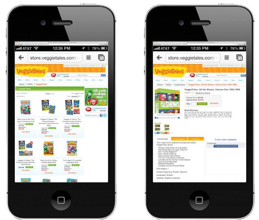
In this example from Veggie Tales, testing a mobile-optimized e-commerce experience helped to increase their revenue from mobile shoppers. Below is the original mobile page. It clearly doesn’t resize to the mobile screen dimensions, CTAs are nearly invisible, and text is difficult to read.
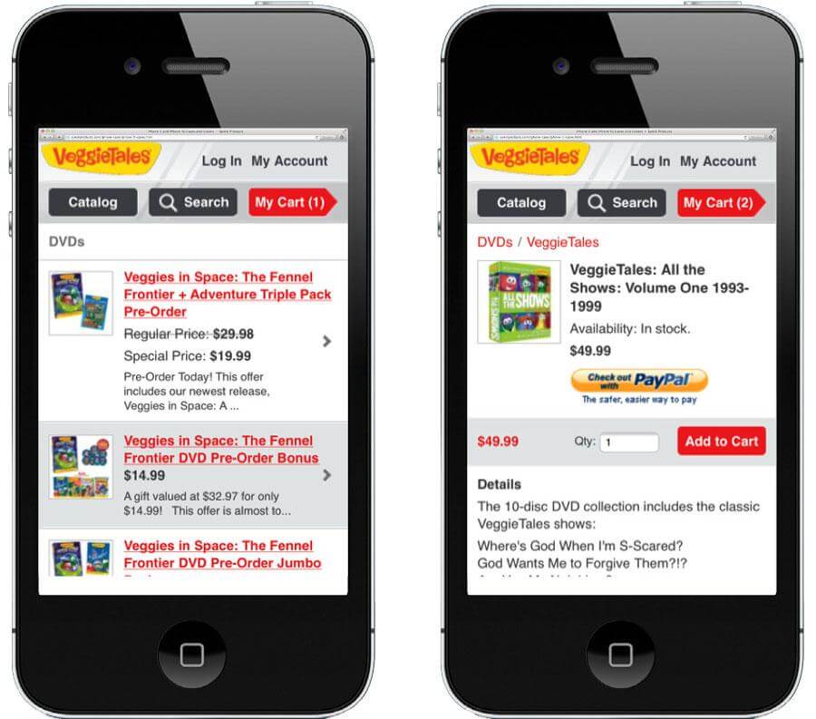
Now see the variation below, which enlarged the CTAs and brought them to the top of the screen, while resizing the category page products display in a full-width list. This mobile-optimized user experience was tested against the original pictured above, and improved revenue per visitor by 28.1%.
Experiment with CTA button placement, fonts, colors, and overall design of your landing page. This is the most effective way to fully optimize it and increase conversions.
Conclusion
Is your mobile landing page already optimized for conversions? If not, make the most of the tips given above and watch your conversions increase. Do you have any tips to add to this list? Feel free to share by leaving a comment below.
